There’s a lot of excitement in the EPM world these days when it comes to REST APIs – and rightfully so. As a developer heavily invested in the EPM space I am excited about some of the possibilities these new APIs offer – and what they will offer in the future. But all of this great new REST API stuff can be quite daunting – how does it work, why should you care, where does it fit in with your overall architecture, and so on. And with ODTUG‘s Kscope18 just around the corner I thought it might be useful to write a primer – or a crash course of sorts – for the EPM professional on what all this REST API business is about. Also be sure to check out one of my presentations at Kscope this year as I will be discussing the OAC Essbase REST API, how to use it, what it does, and more. Continue Reading…
Category Archives: hyperion software
Oracle Open World 2016 Recap
As I mentioned a week or so ago, I made a last minute appearance at Oracle Open World this year. It was my first time attending and presenting at OOW. I actually didn’t catch too much of the conference as I only flew in on Wednesday and flew out on Thursday. Nevertheless, I had a bit of a whirlwind experience, but a very good one. While I hadn’t planned on it (I’m more of a Kscope guy), I am now looking forward to attending Open World next year.
As for the presentation I was part of, I think it went pretty well. Many thanks to Gabby Rubin of Oracle for coming up with the idea for the presentation and facilitating it. The presentation was on “Essbase Tools and Toys” and was meant to highlight, at a high level, some of the interesting things that folks such as myself are doing that involve the Essbase APIs or otherwise work with Essbase. The presentation discussed items created by me, Tim Tow, and Harry Gates. Additionally, Kumar Ramaiyer (also from Oracle) talked a bit about what’s coming with Essbase Cloud Service (EssCS).
cubus outperform EV Analytics Review: Position in the Enterprise
Welcome to the fourth installment of my increasingly inaccurate EV three-part review. If you missed the first three parts, you can check out the EV background, using EV, and using EV continued parts to catch up!
I hope you enjoyed this little mini-series on a really interesting tool so far. As I mentioned in the first article, this tool has a special place in my heart owing to how critical it was to my Essbase life going back as far as 2005. I was quite the EV enthusiast back in the day within my company, but when I talked to people about trying it out or using it, it quite often fell flat. I’d often hear, “Why don’t I use the Excel add-in?” or “Why do I need another tool for that, I already have [whatever]” or “isn’t the enterprise standard [some enterprisey thing]?”
I see where these people were coming from. I get it. In a world where the tools that users are given are often prescribed quite strictly for them, having one more tool to support is matter to be taken lightly: licensing costs, support, training, and all the normal fun IT things.
For these reasons, I prefer to think of EV as another tool in the toolbox for my users – not the exclusive tool. It’s not the end-all-be-all enterprise reporting solution like Financial Reporting, and it’s also a distinct experience apart from Smart View. Consider these tools:
- Smart View
- Planning
- Financial Reporting
- Tableau
- Dodeca
- cubus EV
Then consider the following evaluation criteria:
- Ease of use / Learning curve
- Report definition handled by user or admin?
- Installation
- Data visualization ability
- Primary usage reason
- Relation to other tools
I won’t exhaustively put these all on a spectrum for each property (I’ll save that for a future post), but looking at a few of these products and these evaluation criteria, I can point out a few things.
Smart View, Tableau, and EV are all ostensibly self-serve: you just make them available to the user, they point it at a data source, and then perform analysis and reporting, much to their bean counting merriment. Planning, Dodeca, and Financial Reporting ostensibly require some administrator to have put in some structure ahead of time that the user will consume.
As for ease of use, EV certainly isn’t harder to use than Smart View, if anything it’s a bit simpler. EV makes it hard if not impossible to put your grid into an inconsistent state with respect to the underlying OLAP data source, meaning that you can’t really screw things up by moving some member to the wrong column. Easier to use than EV, however, would be Dodeca and FR. Planning gets kind of its own special place on this spectrum (it’s not easy per se, it’s not hard… it’s something). Similarly for Tableau – a bit of a learning curve, simple reports are fairly straightforward, but the sky is the limit for some of the crazy visualizations you can do.
Speaking of data visualization, Tableau is quite clearly the champ out of all of these. Dodeca and Smart View have similar support for charting (by way of Excel or Excel-like charts). EV’s isn’t ostensibly a data visualization environment, but it’s visualization capabilities in terms of bread and butter charting are compelling, particularly the way that it is an absolutely seamless experience with respect to the data grid you’re working with. In other words, with Excel/Smart View you add in a chart if you want, in EV the data IS the chart if you want it to be. Or it’s just the data – or it’s both at the same time.
Installation for EV is pretty straightforward and a little better than Smart View since there isn’t an installer to worry about, so it’s nice being able to just give your use a URL and away they go. Similar props for Dodeca and most of the other tools on this list.
Final Thoughts
So what does this all add up to? I think that EV is a great tool to have IN the toolbox, but not the ONLY tool in the toolbox. Almost paradoxically it is a compelling tool for your advanced Smart View users but also for Smart View novices that may be intimidated by ad hoc queries and multi-dimensional concepts. EV rewards the user of a well-constructed cube, with a competent and functional UI that extends the value of properly deployed features, such as Dynamic Time Series, UDAs, attribute dimensions, sensible member names, and more.
On the other hand, it doesn’t seem to be for everyone: based on my own prior experience, it can be a confusing addition to the technological landscape for some IT managers (not to mention one more mouth to feed, system-wise), and might run into “But we already have X for that” syndrome. Again, I think it’s a complement and not a replacement or enterprise standard. There are countless scenarios I can imagine where if I were to be dropped into some enterprise as the benevolent dictator of all things BI (or OLAP, or EPM, or whatever), I would say “let’s take this thing out for a spin and see what people think” and would give Decision Systems or cubus a call.
cubus outperform EV Analytics Review: Using EV continued
Welcome to the third part of my review of cubus outperform EV Analytics. You might want to check out the first and second parts if you’re just coming in.
Last time I left off with using EV for grid oriented operations, but EV has some compelling chart features that I wanted to go over. Probably the most compelling aspect of EV’s charting functionality is that you essentially get it for free, and it is seamlessly integrated into the EV experience.
Recall that in the previous EV reviews I did, I mentioned that EV is less freeform than Excel, in a good way. By tightening the user interaction model, EV can provide a more polished user experience. This is true of charts as well. For any given grid you may be looking at, you just have to click the chart button and EV will generate a chart. Note that EV doesn’t generate an image object for you, it literally just changes your view of the data to be a chart rather than a grid.
Here’s an example:
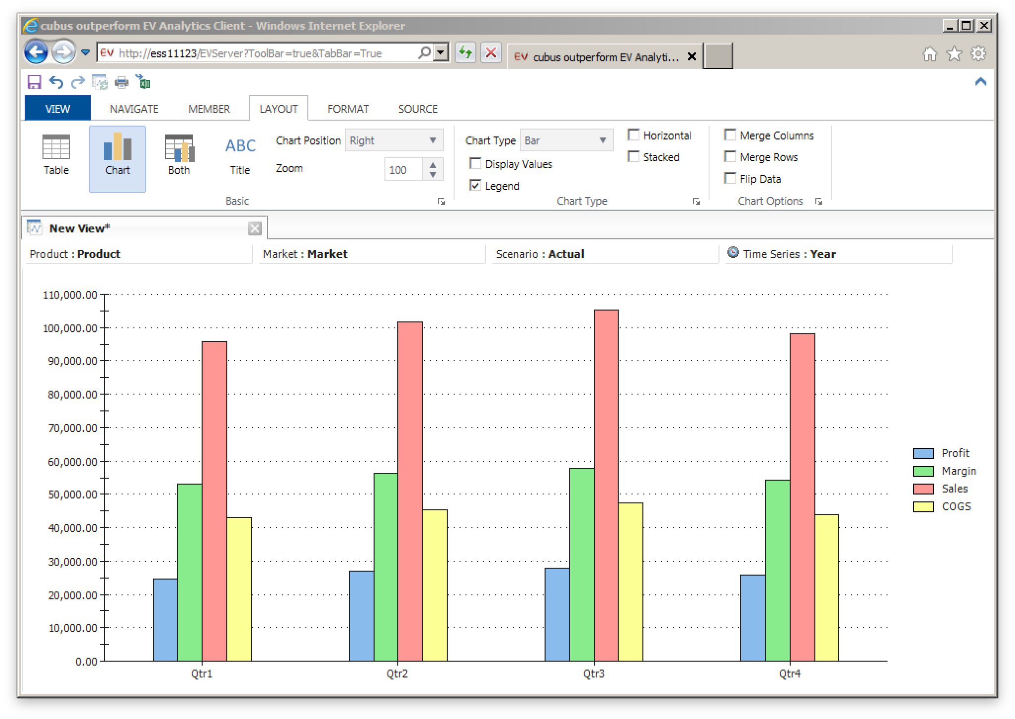
A simple Sample/Basic view that has been changed into a chart
The chart data is based on Sample/Basic as with before. The rows and columns have been used to generate the chart, and the POV/Page members are just “global” members as before. What’s really awesome is that you can click on the members (like Qtr1, Qtr2) and bring up the same member selection dialog as with before. Any member selection changes you make will be automatically reflected in real time, so there’s no chart to update or regenerate.
You can also choose to see both data and a chart at the same time, like this:
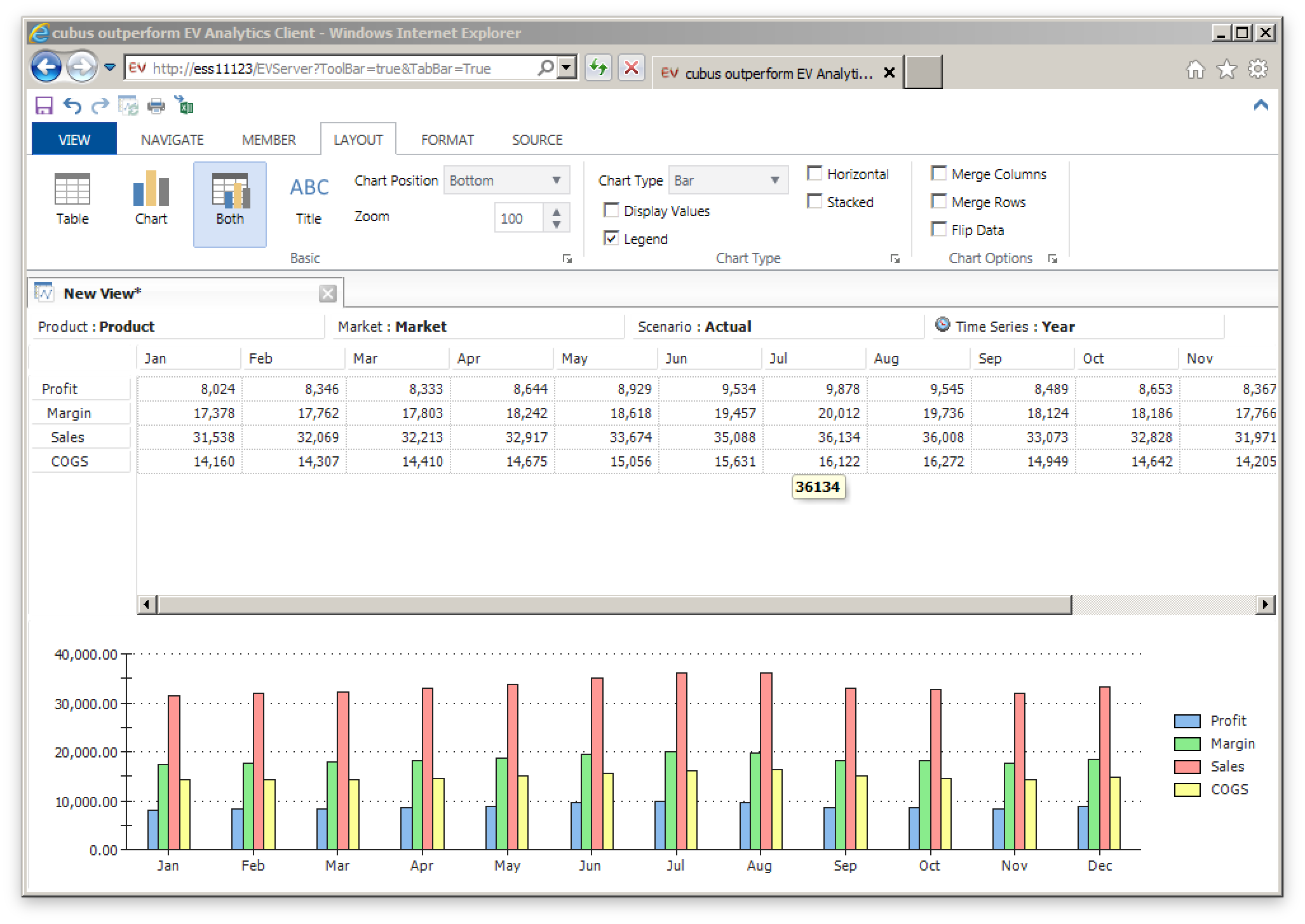
Chart and data shown at the same time (the ‘Both’ option)
This is known as “Both” mode as opposed to Table or Chart which we have now seen. EV provides some rudimentary options for arranging the positions of things. In this case it’s horizontal with chart on the bottom but this can be easily configured a little differently. Other types of charts are also provided.
The charting capabilities in EV won’t give advanced visualization tools like Tableau a run for their money, but they are definitely on par with charting in Excel and in terms of the ease of use, they are much more approachable than Tableau and even Excel. I used to create decks of reports using EV and while they were generally table-based, there were a few “jawdropper” tabs where a particular bar or pie chart really hit a point home.
This article concludes my high-level overview of EV features. This has not been an exhaustive review of EV features, mind you, as EV has some other features that are interesting. These include Canvases (multiple EV views on a single page), user input (like lock and send or submitting data), dynamic selections, awesome support for attribute dimensions and dynamic time series, traffic lighting data cells based on value, and more.
The next part and final part of this series will consider EV’s position within the enterprise and how it stacks up against other tools, including Smart View, Planning, Dodeca, and Tableau.
cubus outperform EV Analytics Review: Using EV
Welcome to Part two of three in my EV review. Yesterday described EV at a very high level: it’s a front-end to Essbase. As I mentioned, think of it as a very polished version of Smart View with a few tricks up its sleeve. Today I want to dive in a little bit on some of the user interface elements of cubus EV to try and convey what I think are some its most compelling features.
To start off with, let’s take a look at the venerable Sample/Basic app. In the following screen we have a default view of the cube pulled up (more or less analogous to the initial retrieve in Smart View).
A simple view of Sample/Basic while on the Navigate ribbon
Note a few things about this user experience and the program. First of all, we are inside of Internet Explorer. EV is not a separate install for users – you pass out the URL to users and they run it themselves. This can save some serious deployment time. A typical view inside of EV will be a single grid with a single data source. In other words, the usage model is one where you have multiple data sources or multiple grids. I’m not saying this is a bad thing, mind you – I think it’s a good thing because you are trading away some of the freeform nature of Excel in exchange for a really smooth user experience.
Everything else in the screenshot should seem pretty intuitive: as with Excel you can have multiple tabs open (sheets in Excel), the POV members (in this case Product, Market, Actual) are available at the top of the sheet, and you have you normal rows and columns (Profit and the various Quarters, in this case). The various toolbar buttons available are fairly predictable in their utility.
While we’re on this screenshot, I want to mention something about the ad hoc experience that I really like. Each member in a row or column is clickable and provides various capabilities. There are two arrows on each member (up and down) and you can click or right click on them. Clicking on the down arrow on Year, for example, will replace it with the children (Qtr1, Qtr2, Qtr3, Qtr4). Right clicking on the the down arrow would drill to the children but also retain the parent. Drilling up works in a similar fashion. It seems like a small UI touch but as I have said a few times, EV is all about that smooth user experience and I think it really rewards the user that wants to be fast and efficient with their ad hoc data exploration.
Still on the subject of defining the POV, let’s say that you know or want to find the specific members you want to show. By clicking on the member itself, you can bring up a member selection box for that dimension. This is another one of the really strong points of EV because you can pick the member and no matter where in the spread it is (row, column, leftmost, topmost, etc.) it’ll automatically adjust everything for you. For example, if you are looking at Actual and Budget from the Scenario dimension and have four Quarters selected, no matter where your Time axis is, you can select any other members from the Time dimension and it’ll move everything around automatically. This is one of my pet peeves with the Member Selection box in Smart View or the old Excel add-in where the EV user experience is amazing.
Here’s the EV dialog for selecting the members you want from a dimension:
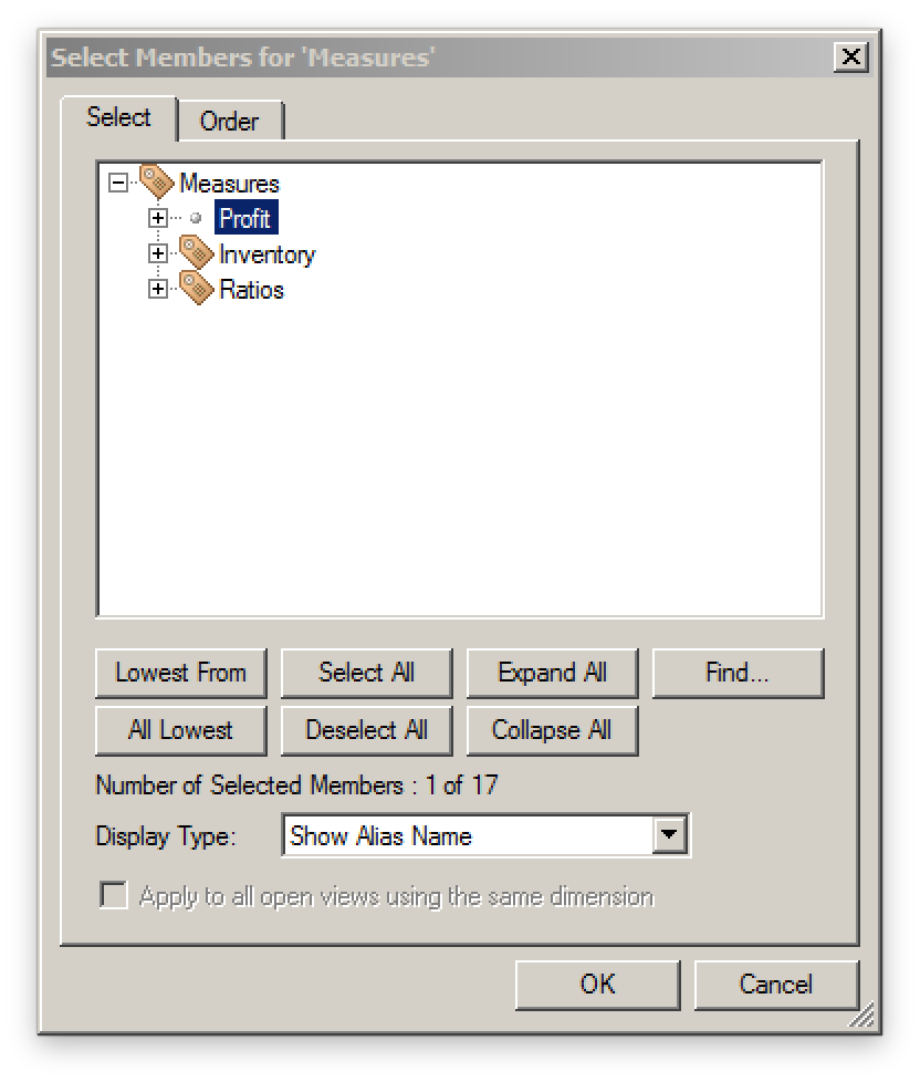
A member selector in the Measures dimension showing selection options and icons denoting Label Only members
Again, note the rich UI we get: icons for Label Only members in the outline have a little label tag on them, there are convenient buttons to select all of the members that are visible, to expand the whole hierarchy, to take the lowest, toggle aliases, and more. The Find… dialog is very convenient for quickly hanging down particular members with search criteria.
Again, as an incredibly minor detail I want to mention another UI element I love: if you want to select or deselect several members, you don’t have to individually click them. The list dialog employs this kind of smart drag where if you start highlighting a member and drag down, it selects all the members you drag to, and similarly if you are deselecting. Again, minor feature, but great user experience.
The other tab on this dialog let’s you pick the order of the members:
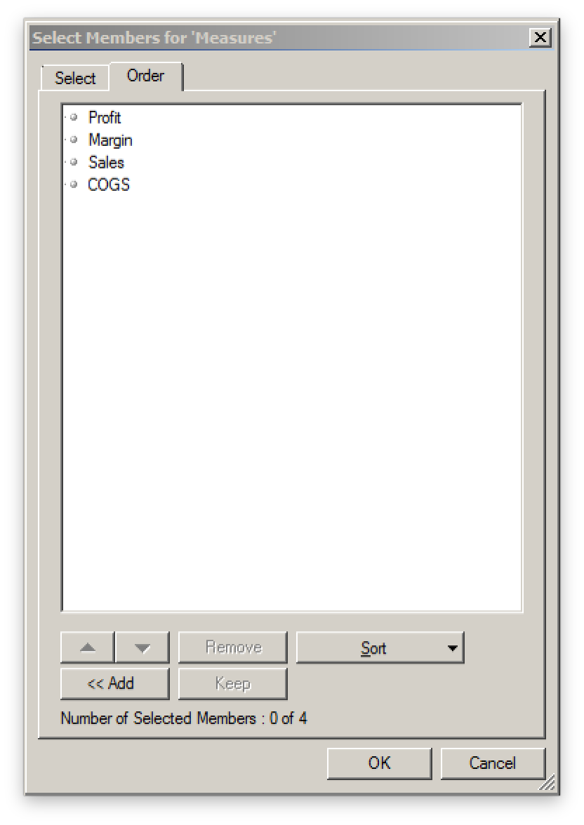
Choosing the order for selected measures
It’s a simple and intuitive dialog but has some really nice features for moving things around just how you want them, or sorting some criteria (like alphabetically or outline order). Again, the UI respects our time and gives us a way to get to exactly what we want as quickly as possible.
Moving on, let’s talk about formatting up the grid. Most traditional formatting options are available: bold, italic, background/foreground colors, and more. You can add spacing between rows and borders. Bold text is probably my most used format, followed by spacing rows out by a half a row width, then applying a border and possibly some decimal formatting.
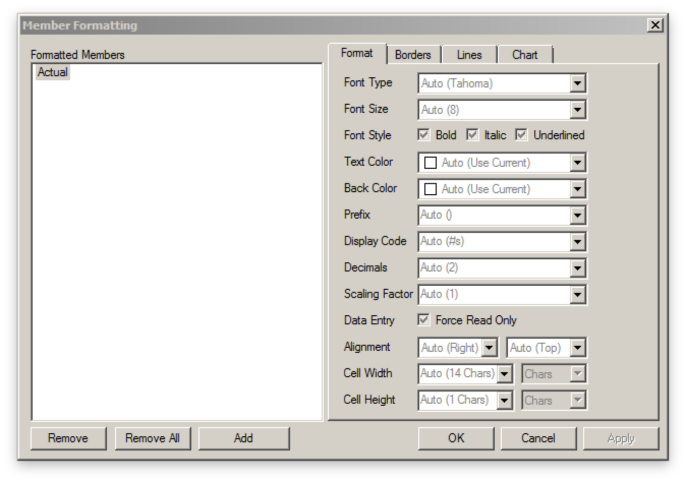
Formatting options for cells
Probably the best aspect of formatting a grid in EV is the way in which it cascades the formatting across the whole grid. Smart View these days provides improved support for pivoting around formatting, but EV has done this for years.
Think of formatting as applying to members and not particular cells. Let’s say that I have 13 members in my time dimension: all 12 months and a single total for the year. I want the total (Time/Year) for the year to be bold. I go to the formatting dialog for Time and then select bold. Now all the members in the row are bold. If I pivot Time, say from column to rows, the formatting moves with it. Now let’s say that I have different locations on this grid too, and I want the total for all locations to be underlined (for some reason). I right-click, apply the formatting, and now the totals for location are underlined and of course the total for location and time is both bold and underlined. I can pivot around all I want and this formatting will be retained. Nicely enough, if I decide to clear out all of the formatting for one of the members, I don’t have to go and “fix up” a single cell.
EV formatting is really convenient I wish Smart View was a little more like it, but I think that’s just how it has to be given the different environments and paradigms these programs use.
So let’s see here, so far we can choose a connection, pivot around, quickly drill down to the members we want to see, easily refine our member selection, reorder it, and apply formatting. Additionally, the formatting moves around easily, and is applied in a cascading manner so we don’t have to mess around with single cells and formatting getting whacky on us.
Check back tomorrow for a more of the EV user experience where I’ll cover basic chart capabilities and a few other goodies!
cubus outperform EV Analytics Review: Background

As you readers know well by now (and judging by having been posting to this blog for over half a decade), I certainly seem to enjoy all things Essbase (and ODI, and Java, and mobile, and more…). In addition to writing my own software for making Essbase even better, one thing I’d like to do more of is review and offer some thoughts on other software that works with or otherwise enhances Essbase.
To that end, I am pleased to do this review of cubus outperform EV Analytics. This review will occur in three parts:
- Background (this posting)
- Using cubus EV
- Position in the Enterprise
For short I’ll just refer to this software as EV or cubus EV. So, just what is EV? Think of it as a front-end to Essbase. I think you really just have to use EV to get an appreciation for how it works and what it can do, but I’m going to do my best to describe it.
What is it?
Most or all of you reading this should be familiar with how the Excel add-in and Smart View works. Consider the typical ad hoc experience in Smart View and Excel. Now imagine that you want to recreate the ad hoc experience and completely polish and refine every aspect of it, including the user interface, user experience, and just for good measure, add in some really slick features. Now you have EV. Think of EV as trading in some of the freeform nature of Excel in exchange for a more fluid user experience.
This might not seem like a big deal, but to someone such as myself that likes to approach software with an artisan and craftsmanship mentality, it really resonates.
Chart and data shown at the same time (the ‘Both’ option)
Personal History with EV
I first got introduced to EV – then called Executive Viewer – back in 2005 while working for the then smallest subsidiary of best grocer on the planet. As luck would have it, my controller/CFO had fallen in love with the product at his previous company, and one of our other divisions happened to have a spare license to EV just sitting around – so we transferred it over and got up and running. At the time, EV was owned and marketed by a company called Temtec.
Now, I’m a little fuzzy on all this, but my first experience with EV was that it was sold by and supported by Temtec. There seemed to be a sequence of acquisitions and Temtec was gobbled up by Applix, which was gobbled up by Cognos, and then IBM. IBM didn’t seem to otherwise have any major plans for this curious spoil of corporate war, but along came cubus to buy it out and resurrect it. All of this leads us up to now: In the United States, EV is sold through Decision Systems. Elsewhere, it is available through cubus.
Please check back tomorrow for Part 2: Using cubus EV