jason w. jones

software from the trenches

Deleted journalized rows in ODI populating target with NULLs

This issue has been on my radar for awhile and I finally had a chance to dig into it the other day. I noticed an occasional issue for an ODI job that journalized a large source table and updated corresponding rows in a target on another system. The source and target are both Oracle databases so I’m using the DBLINK LKM and in this case using the MERGE IKM.

If you’re not familiar with journalized tables in ODI, it’s a really great feature that allows you to track rows that are inserted/updated on a table and then process only those rows when you run the interface. This capability is leveraged simply by way of a checkbox to tell the interface to only process the new rows (of course, setting up the journalization itself is a couple of extra steps but it’s also pretty straightforward). Journalization is incredibly useful in a variety of situations. The main one is that if the source is huge, you can’t or don’t want to process the entire table just to sync up with a target.

In addition to being able to track inserted and updated rows, with a simple option you can also synchronize deletions. This means that if a row gets deleted in the source, you have the option to delete the corresponding row (based on the primary key) in the target. I’d say about half of the interfaces I make with journalization have this option turned on and half have it turned off.

That all being said, I have a few interfaces at a client that have synchronize deletions turned on, but the sources very rarely get a row deleted. In fact, they almost never get a row deleted. But these interfaces have been failing now and then and the root cause turns out to be that some rows in the source were being manually deleted. The actual error as seen in ODI, however, is that an insert to the target table is failing on account of the ODI job trying to insert null values into columns that require non-null values. Curiously, these rows were not null in the source. As it turns out, ODI was getting null values because it was doing a left outer join with deleted records (generating records with just a primary key and all null fields).

But wait, shouldn’t these be deleted? Yes! I dug through the steps in the Operator, however, and there was no step that was deleting these rows from the flow table. So let’s take a look at the steps in the IKM:
ODI Oracle MERGE IKM steps


I see two critical steps with Order 140 and 150. Step 140 “Synchronize deletions from journal” is running and does exactly what we think it should do: delete records from the target that were deleted in the source. So far so good.
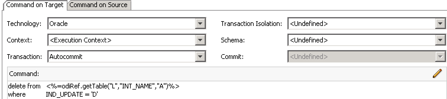
VMware Fusion

But based on analysis, this left some rows in the flow table (the temporary ODI staging table) that were just getting reinserted once again. But there’s a step for handling that!
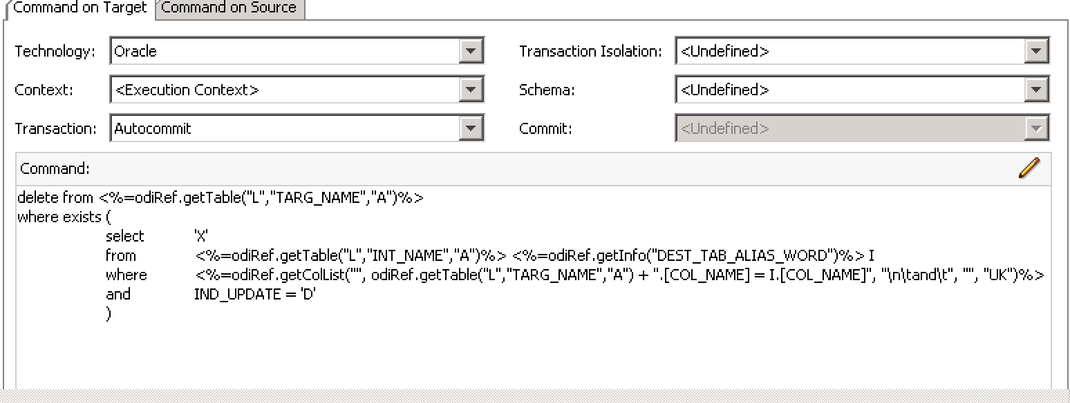
VMware Fusion

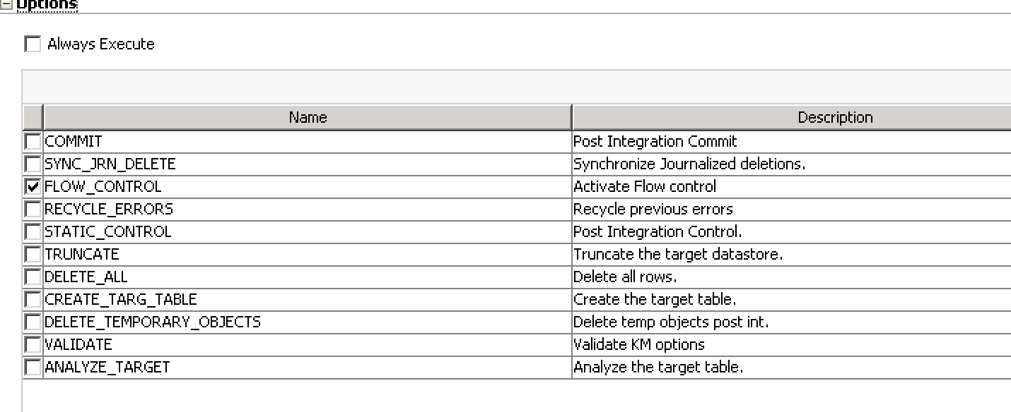
We have the “remove deleted rows from flow table” that removes the deleted rows from the flow table, so that they therefore won’t be part of the join that creates the rows to go to the target. But why isn’t that step running? Well, it’s set to only execute if the FLOW_CONTROL option is set, as shown below:

VMware FusionSo, perhaps counterintuitively (for me, right now, at least…) the synchronize deletions is dependent on FLOW_CONTROL being turned on, and the issue was that Flow Control was turned off in this job. I don’t think this is a bug, but if caught me by surprised. I turned the option back on (the default is actually on but it was off for whatever reason), regenerated the scenario, and this issue is solved for now. At the moment I am of the thinking that this step shouldn’t be tied to Flow Control but I’m not going to question it for now. Hopefully this helps someone out down the road (but more likely I’ll Google it in a couple of years and help myself out, which curiously was the original motivation for this blog…)

cubus outperform EV Analytics Review: Using EV

Welcome to Part two of three in my EV review. Yesterday described EV at a very high level: it’s a front-end to Essbase. As I mentioned, think of it as a very polished version of Smart View with a few tricks up its sleeve. Today I want to dive in a little bit on some of the user interface elements of cubus EV to try and convey what I think are some its most compelling features.

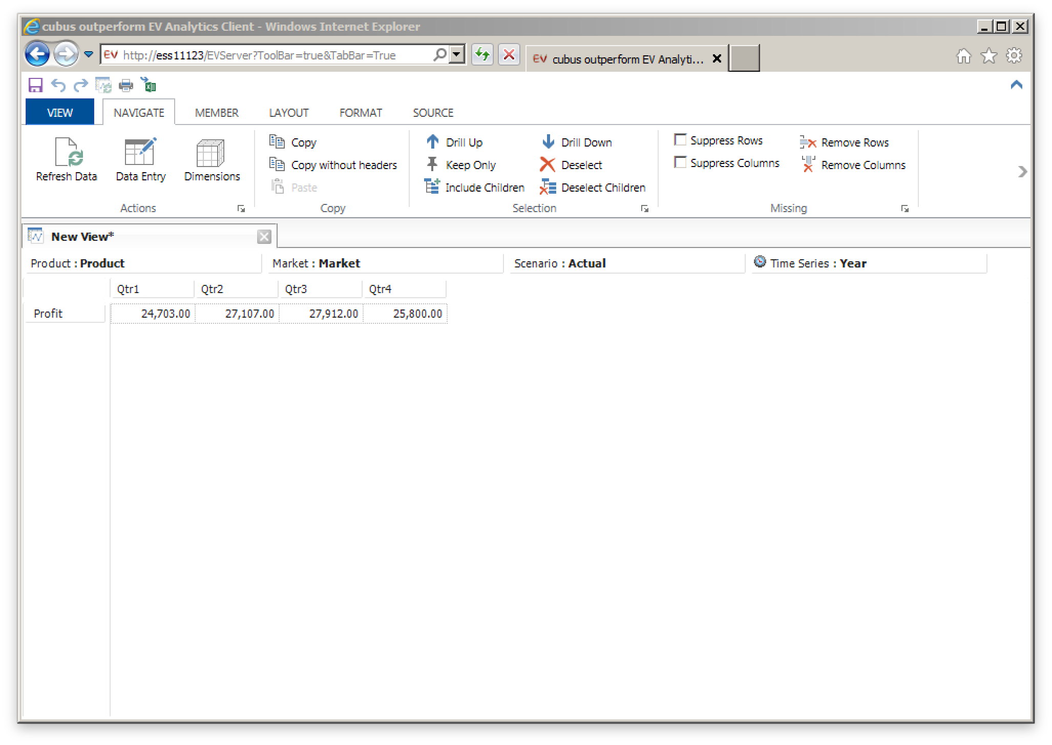
To start off with, let’s take a look at the venerable Sample/Basic app. In the following screen we have a default view of the cube pulled up (more or less analogous to the initial retrieve in Smart View).

A simple view of Sample/Basic while on the Navigate ribbon

A simple view of Sample/Basic while on the Navigate ribbon

Note a few things about this user experience and the program. First of all, we are inside of Internet Explorer. EV is not a separate install for users – you pass out the URL to users and they run it themselves. This can save some serious deployment time. A typical view inside of EV will be a single grid with a single data source. In other words, the usage model is one where you have multiple data sources or multiple grids. I’m not saying this is a bad thing, mind you – I think it’s a good thing because you are trading away some of the freeform nature of Excel in exchange for a really smooth user experience.

Everything else in the screenshot should seem pretty intuitive: as with Excel you can have multiple tabs open (sheets in Excel), the POV members (in this case Product, Market, Actual) are available at the top of the sheet, and you have you normal rows and columns (Profit and the various Quarters, in this case). The various toolbar buttons available are fairly predictable in their utility.

While we’re on this screenshot, I want to mention something about the ad hoc experience that I really like. Each member in a row or column is clickable and provides various capabilities. There are two arrows on each member (up and down) and you can click or right click on them. Clicking on the down arrow on Year, for example, will replace it with the children (Qtr1, Qtr2, Qtr3, Qtr4). Right clicking on the the down arrow would drill to the children but also retain the parent. Drilling up works in a similar fashion. It seems like a small UI touch but as I have said a few times, EV is all about that smooth user experience and I think it really rewards the user that wants to be fast and efficient with their ad hoc data exploration.

Still on the subject of defining the POV, let’s say that you know or want to find the specific members you want to show. By clicking on the member itself, you can bring up a member selection box for that dimension. This is another one of the really strong points of EV because you can pick the member and no matter where in the spread it is (row, column, leftmost, topmost, etc.) it’ll automatically adjust everything for you. For example, if you are looking at Actual and Budget from the Scenario dimension and have four Quarters selected, no matter where your Time axis is, you can select any other members from the Time dimension and it’ll move everything around automatically. This is one of my pet peeves with the Member Selection box in Smart View or the old Excel add-in where the EV user experience is amazing.

Here’s the EV dialog for selecting the members you want from a dimension:

A member selector in the Measures dimension showing selection options and icons denoting Label Only members

A member selector in the Measures dimension showing selection options and icons denoting Label Only members

Again, note the rich UI we get: icons for Label Only members in the outline have a little label tag on them, there are convenient buttons to select all of the members that are visible, to expand the whole hierarchy, to take the lowest, toggle aliases, and more. The Find… dialog is very convenient for quickly hanging down particular members with search criteria.

Again, as an incredibly minor detail I want to mention another UI element I love: if you want to select or deselect several members, you don’t have to individually click them. The list dialog employs this kind of smart drag where if you start highlighting a member and drag down, it selects all the members you drag to, and similarly if you are deselecting. Again, minor feature, but great user experience.

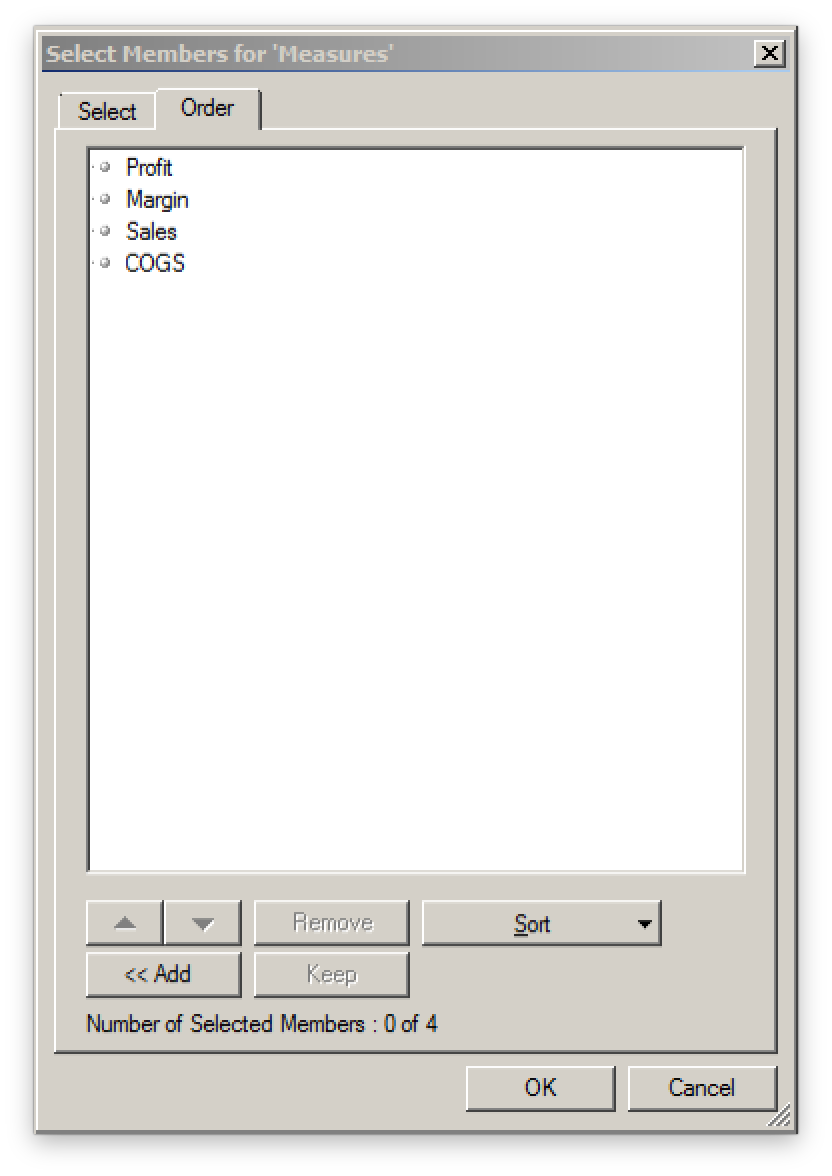
The other tab on this dialog let’s you pick the order of the members:

Choosing the order for selected measures

Choosing the order for selected measures

It’s a simple and intuitive dialog but has some really nice features for moving things around just how you want them, or sorting some criteria (like alphabetically or outline order). Again, the UI respects our time and gives us a way to get to exactly what we want as quickly as possible.

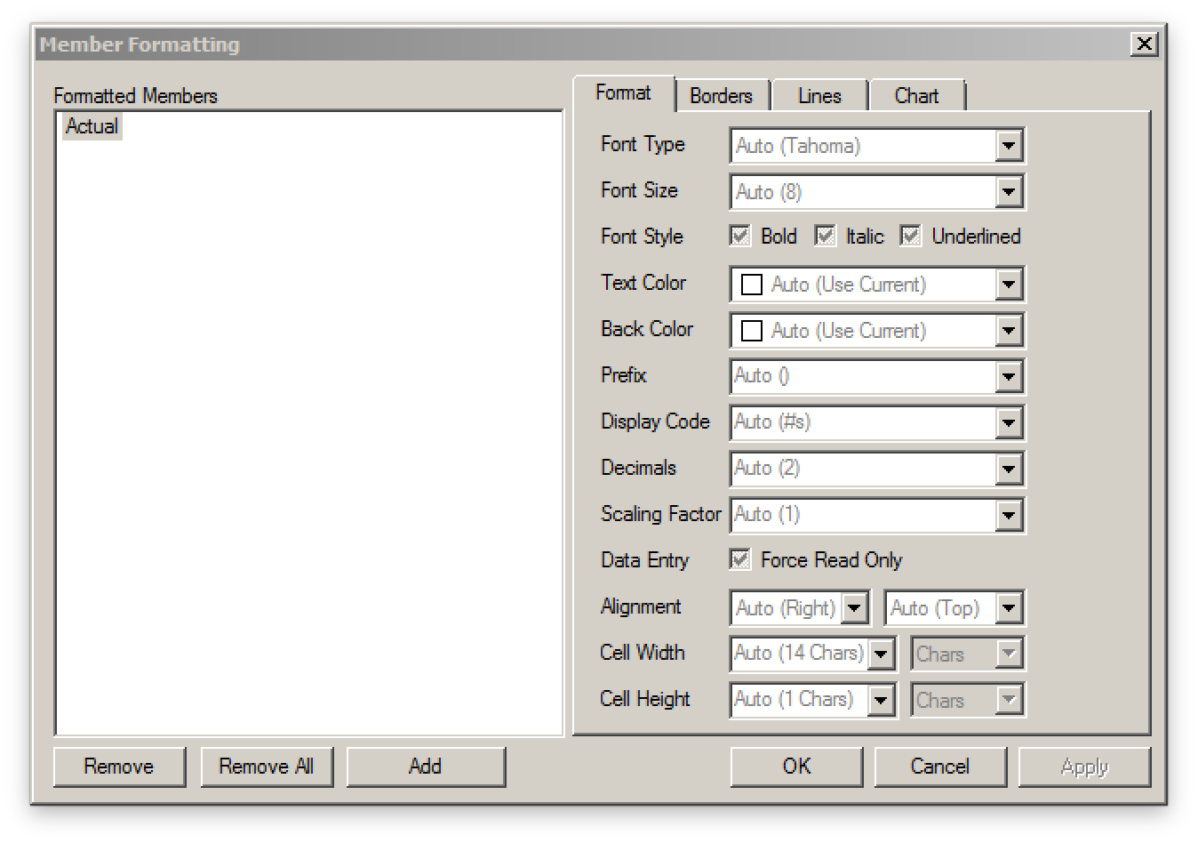
Moving on, let’s talk about formatting up the grid. Most traditional formatting options are available: bold, italic, background/foreground colors, and more. You can add spacing between rows and borders. Bold text is probably my most used format, followed by spacing rows out by a half a row width, then applying a border and possibly some decimal formatting.

Formatting options for cells

Formatting options for cells

Probably the best aspect of formatting a grid in EV is the way in which it cascades the formatting across the whole grid. Smart View these days provides improved support for pivoting around formatting, but EV has done this for years.

Think of formatting as applying to members and not particular cells. Let’s say that I have 13 members in my time dimension: all 12 months and a single total for the year. I want the total (Time/Year) for the year to be bold. I go to the formatting dialog for Time and then select bold. Now all the members in the row are bold. If I pivot Time, say from column to rows, the formatting moves with it. Now let’s say that I have different locations on this grid too, and I want the total for all locations to be underlined (for some reason). I right-click, apply the formatting, and now the totals for location are underlined and of course the total for location and time is both bold and underlined. I can pivot around all I want and this formatting will be retained. Nicely enough, if I decide to clear out all of the formatting for one of the members, I don’t have to go and “fix up” a single cell.

EV formatting is really convenient I wish Smart View was a little more like it, but I think that’s just how it has to be given the different environments and paradigms these programs use.

So let’s see here, so far we can choose a connection, pivot around, quickly drill down to the members we want to see, easily refine our member selection, reorder it, and apply formatting. Additionally, the formatting moves around easily, and is applied in a cascading manner so we don’t have to mess around with single cells and formatting getting whacky on us.

Check back tomorrow for a more of the EV user experience where I’ll cover basic chart capabilities and a few other goodies!


cubus outperform EV Analytics Review: Background

As you readers know well by now (and judging by having been posting to this blog for over half a decade), I certainly seem to enjoy all things Essbase (and ODI, and Java, and mobile, and more…). In addition to writing my own software for making Essbase even better, one thing I’d like to do more of is review and offer some thoughts on other software that works with or otherwise enhances Essbase.

To that end, I am pleased to do this review of cubus outperform EV Analytics. This review will occur in three parts:

  • Background (this posting)
  • Using cubus EV
  • Position in the Enterprise

For short I’ll just refer to this software as EV or cubus EV. So, just what is EV? Think of it as a front-end to Essbase. I think you really just have to use EV to get an appreciation for how it works and what it can do, but I’m going to do my best to describe it.

What is it?

Most or all of you reading this should be familiar with how the Excel add-in and Smart View works. Consider the typical ad hoc experience in Smart View and Excel. Now imagine that you want to recreate the ad hoc experience and completely polish and refine every aspect of it, including the user interface, user experience, and just for good measure, add in some really slick features. Now you have EV. Think of EV as trading in some of the freeform nature of Excel in exchange for a more fluid user experience.

This might not seem like a big deal, but to someone such as myself that likes to approach software with an artisan and craftsmanship mentality, it really resonates.

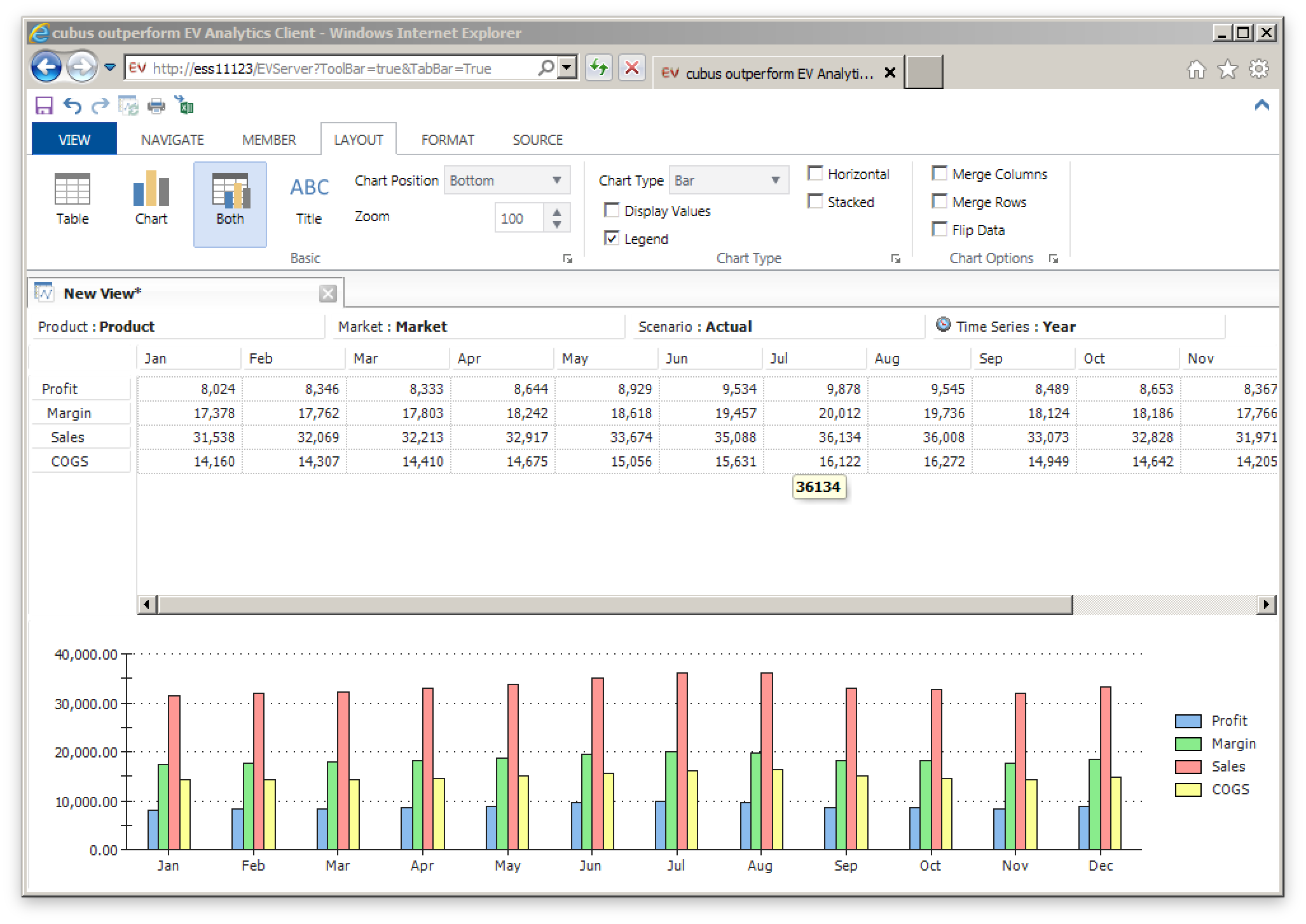
Chart and data shown at the same time (the 'Both' option)

Chart and data shown at the same time (the ‘Both’ option)

Personal History with EV

I first got introduced to EV – then called Executive Viewer – back in 2005 while working for the then smallest subsidiary of best grocer on the planet. As luck would have it, my controller/CFO had fallen in love with the product at his previous company, and one of our other divisions happened to have a spare license to EV just sitting around – so we transferred it over and got up and running. At the time, EV was owned and marketed by a company called Temtec.

Now, I’m a little fuzzy on all this, but my first experience with EV was that it was sold by and supported by Temtec. There seemed to be  a sequence of acquisitions and Temtec was gobbled up by Applix, which was gobbled up by Cognos, and then IBM. IBM didn’t seem to otherwise have any major plans for this curious spoil of corporate war, but along came cubus to buy it out and resurrect it. All of this leads us up to now: In the United States, EV is sold through Decision Systems. Elsewhere, it is available through cubus.

Please check back tomorrow for Part 2: Using cubus EV


Drillbridge on Linux

Did I mention recently that Drillbridge can now be installed on Linux in addition to Windows (in fact, Drillbridge is so flexible, it now runs on Windows, Linux, Mac OS X, and AIX all out of the box!). WELL IT DOES!

So regardless if your Hyperion environment is running on Windows, Linux, or AIX, it’s now easier than ever to add Drillbridge to one of your servers and unlock the power of your detailed data for your users.

Kscope15 – Two Presentations

Just wanted to mentioned that I’ll be at Kscope15 (you have registered, haven’t you?) with two brand new presentations. I will be presenting on Drillbridge, the innovative, awesome, easy to implement, super cool, fun, free, and fast drill-through solution, as well as a really interesting twist on an ODI feature.

For the ODI presentation I will be doing a super detailed, incredibly deep dive on one of the main features of ODI – mappings and interfaces – and how they work under the hood, how to make/customize Knowledge Modules, and more. I’m really excited for this presentation because it’s a total nerd look at how and why things are setup the way they are, filtered through the lens of a computer scientist (with a nice helping of cube geekery). I don’t seem to get to write about ODI as much as I write about Hyperion-related things, but truth be told if I had to rate my Oracle-specific skills in order of strength, it would go Java, ODI, and then Hyperion. Go figure.

Anyway, get to registering for Kscope as soon as you can; I have a feeling this year’s is going to be the most awesome yet, and when you do, be sure to swing by my presentations and geek out with me and introduce yourself.

Drillbridge 1.5.0 available!

It took a little longer than anticipated (I took some genuine time off over the holiday break), but I am very happy to make Drillbridge version 1.5.0 available to download.

A lot of work has gone into this release. For example:

  • You can now drill from columns (!)
  • Use your own custom mappings to resolve member names (this is a super cool feature I wrote about earlier and it knocks the pants off of Essbase Studio (as far as I know) by allowing you to write in mappings for your own members that might not have children (for example, a YTD member in the Time dimension)
  • Streaming output performance enhanced
  • Now generates XLSX files with much better output (not everything is treated as a String – if the column type is DATE or TIME or TIMESTAMP, it gets treated and formatted accordingly)
  • Now run Drillbridge from Linux!
  • All files included that should allow for running on Windows, Linux, AIX, Solaris, and even Mac OS X
  • Java 7 or newer is required! I know this might be an inconvenience but I pretty much had to, and it’s good to get current with Java. Java 1.8/8 should work just fine as well in case you want to go all out

I have done my absolute best to test this version and make sure it doesn’t have any showstopper bugs but there are bound to be issues. There are a few things I know need to be worked on for the inevitable 1.5.1 release. So if you upgrade, please be sure to make backups so you can flip back to 1.3.3 or 1.3.4 or whatever your current version is, in case there’s something broken that you need.

If you have any questions about the new features and how to use them, don’t hesitate to hit up the forums or email. In the coming days I will be adding on to the Drillbridge Wiki with some info about how to set things up in terms of new features. There was recently a lot of spam activity on the wiki that I’m trying to sort out but for now it looks okay.

That all being said, this is the best release of Drillbridge ever and it now contains every feature I originally set out to put in, and then some. There will undoubtedly be some quirks but I look forward to a few point releases to stamp them out. Many or most of the features are from direct user requests, feedback, and ideas, so thanks to everyone.

Happy Drilling.

Essbase Outline Export Parser released

I had a use-case today where I needed to parse an XML file created by the relatively new MaxL command “export outline”. This command generates an XML file for a given cube for either all dimensions or just all dimensions you specify. I just needed to scrape the file for the hierarchy of a given dimension, and that’s exactly what this tool does: pass in an XML file that was generated by export outline, then pass in the name of a dimension, and the output to the console will be a space-indented list of members in the dimension. More information on usage at the Essbase Outline Export Parser GitHub page including sample input, sample output, and command-line usage.

Also note that the venerable Harry Gates has also created something similar that includes a GUI in addition to working on the command line. While both written in Java, we’re using different methods to parse the XML. Since I’m more familiar/comfortable with JAXB for reading XML I went with that, which in my experience gives a nice clean and extensible way to model the XML file and read it without too much trouble. The code for this project could be easily extended to provide other output formats.

Camshaft 1.0.1 released

Quick bug fix release (thanks to Peter N. for the heads up!). There was a problem with the way the runnable JAR was packaged. A new version can be downloaded from the Camshaft downloads page.

Camshaft is a Java command-line utility that executes MDX queries against a given cube and returns the results in a sensible format for loading or processing with your own tools (as opposed to you having to use voodoo or something to try and parse it into something usable). So stop parsing header bullshit off of MDX queries and start parsing complements from your users saying how awesome you are.

Drillbridge 1.4.0 Feature Preview: Custom Mappings

Drillbridge 1.4.0 is coming out later this month and it contains some really cool features. Today I am going to go over one of them. This feature is called “Custom Mappings” and while it’s ostensibly simple, it is a huge win for drill-through and cube design.

Consider the scenario where you are drilling from a member in the Time dimension. Drilling from January (Jan), February (Feb), and so on are straightforward (especially with Drillbridge’s convenience methods for mapping these to 01, 02 and such). Even drilling from upper-level members is a snap – Drillbridge gets handed the member Qtr1, for example, then opens the outline to get the three children, then applies the mappings to those and plugging it into the query (so the relevant query fragment might be WHERE Period IN ('01', '02', '03') or something.

Everything is great, right? Well, what about those YTD members you often see in ASO cubes as an alternate hierarchy? Something like this:

  • YTD (~)
    • YTD_Jan (~) Formula: [Jan]
    • YTD_Feb (~) Formula: [Jan] + [Feb]
    • YTD_Mar (~) Formula: [Jan] + [Feb] + [Mar]
    • etc.

The problem with these members is that they are dynamic calcs with no children. So if you try to drill on this, then Drillbridge would literally be querying the database for a period member named “YTD_Feb”, for example.

I have sort of worked around this before in Studio by instead putting shared members under these. Under YTD_Jan you have a shared member Jan, under YTD_Feb you have shared members Jan and Feb, and so on. This works, although it’s a bit cumbersome and feels a little clunky.

Custom Mappings to the Rescue!

Custom Mappings is a new Drillbridge feature that allows you to specify a list of member names to use when drilling on certain member names. If a Custom Mapping is added to a report, Drillbridge will consult that first for child member names. If a mapping isn’t found then Drillbridge will just use the normal provider of mappings (e.g. it’ll open the cube outline and use that).

All that’s needed to create custom mappings is to put them in a file. Here’s an example:

YTD_Jan,Jan

YTD_Feb,Jan
YTD_Feb,Feb

YTD_Mar,Jan
YTD_Mar,Feb
YTD_Mar,Mar

YTD_Apr,Jan
YTD_Apr,Feb
YTD_Apr,Mar
YTD_Apr,Apr

YTD_May,Jan
YTD_May,Feb
YTD_May,Mar
YTD_May,Apr
YTD_May,May

YTD_Jun,Jan
YTD_Jun,Feb
YTD_Jun,Mar
YTD_Jun,Apr
YTD_Jun,May
YTD_Jun,Jun

YTD_Jul,Jan
YTD_Jul,Feb
YTD_Jul,Mar
YTD_Jul,Apr
YTD_Jul,May
YTD_Jul,Jun
YTD_Jul,Jul

YTD_Aug,Jan
YTD_Aug,Feb
YTD_Aug,Mar
YTD_Aug,Apr
YTD_Aug,May
YTD_Aug,Jun
YTD_Aug,Jul
YTD_Aug,Aug

YTD_Sep,Jan
YTD_Sep,Feb
YTD_Sep,Mar
YTD_Sep,Apr
YTD_Sep,May
YTD_Sep,Jun
YTD_Sep,Jul
YTD_Sep,Aug
YTD_Sep,Sep

YTD_Oct,Jan
YTD_Oct,Feb
YTD_Oct,Mar
YTD_Oct,Apr
YTD_Oct,May
YTD_Oct,Jun
YTD_Oct,Jul
YTD_Oct,Aug
YTD_Oct,Sep
YTD_Oct,Oct

YTD_Nov,Jan
YTD_Nov,Feb
YTD_Nov,Mar
YTD_Nov,Apr
YTD_Nov,May
YTD_Nov,Jun
YTD_Nov,Jul
YTD_Nov,Aug
YTD_Nov,Sep
YTD_Nov,Oct
YTD_Nov,Nov

YTD_Dec,Jan
YTD_Dec,Feb
YTD_Dec,Mar
YTD_Dec,Apr
YTD_Dec,May
YTD_Dec,Jun
YTD_Dec,Jul
YTD_Dec,Aug
YTD_Dec,Sep
YTD_Dec,Oct
YTD_Dec,Nov
YTD_Dec,Dec

With this Custom Mapping in place on a report, drill-to-bottom can be provided on a cube’s Time dimension YTD members. You get all of this functionality without having to tweak the outline, add a bunch of shared members, or anything. And what’s even better – you’ll even save a whole trip to the outline. If there is some member that is problematic to resolve, for some reason, or you just wanted to override the member resolution process, you could also stick it in the custom mapping.

Just for completeness, let’s take a look at the admin screens for editing and updating Custom Mappings. Here’s an overview of all of the different Custom Mappings that have been created:

Drillbridge Custom Mappings List

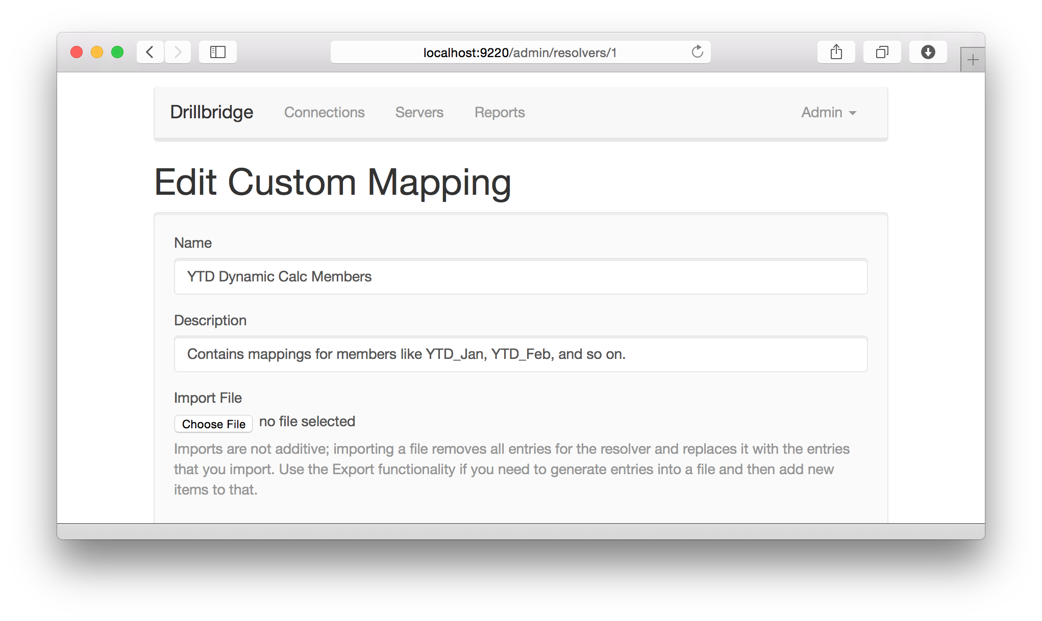
Here’s a look at editing a Custom Mapping:

Drillbridge Edit Custom MappingAnd here’s previewing the list of individual mappings available for a given mapping (that have been uploaded by importing a text file):

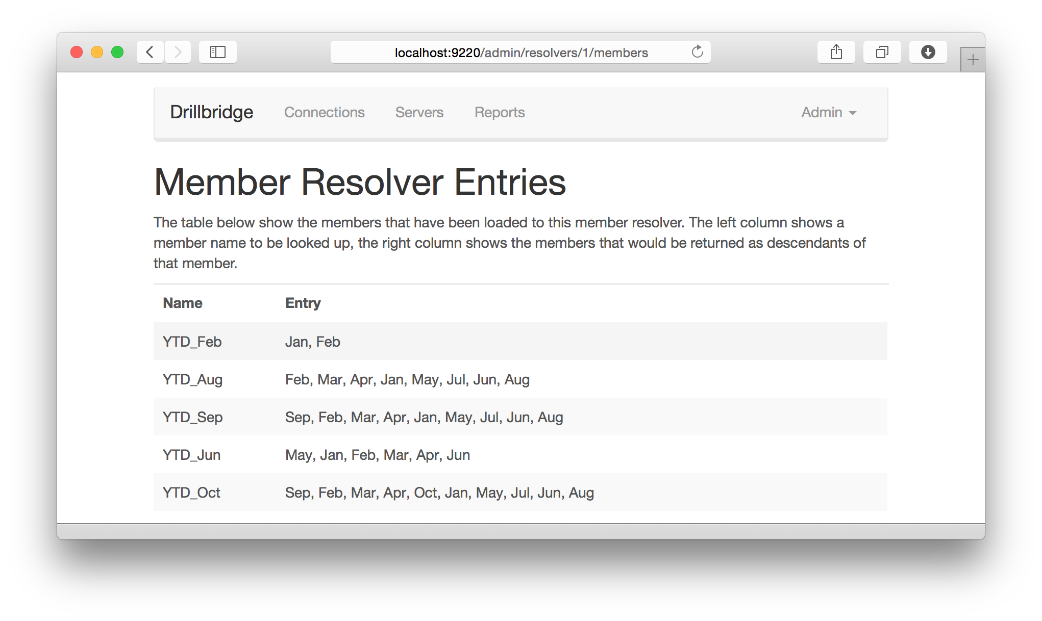
Drillbridge View Entries in a Custom MappingThere you have it. As I mentioned, this feature will be available in upcoming release version 1.4.0, which should be out later this month. This feature is really, really cool, and there are a few more things this release adds that I will be talking about over the next week up to the release.