Welcome to Part two of three in my EV review. Yesterday described EV at a very high level: it’s a front-end to Essbase. As I mentioned, think of it as a very polished version of Smart View with a few tricks up its sleeve. Today I want to dive in a little bit on some of the user interface elements of cubus EV to try and convey what I think are some its most compelling features.
To start off with, let’s take a look at the venerable Sample/Basic app. In the following screen we have a default view of the cube pulled up (more or less analogous to the initial retrieve in Smart View).
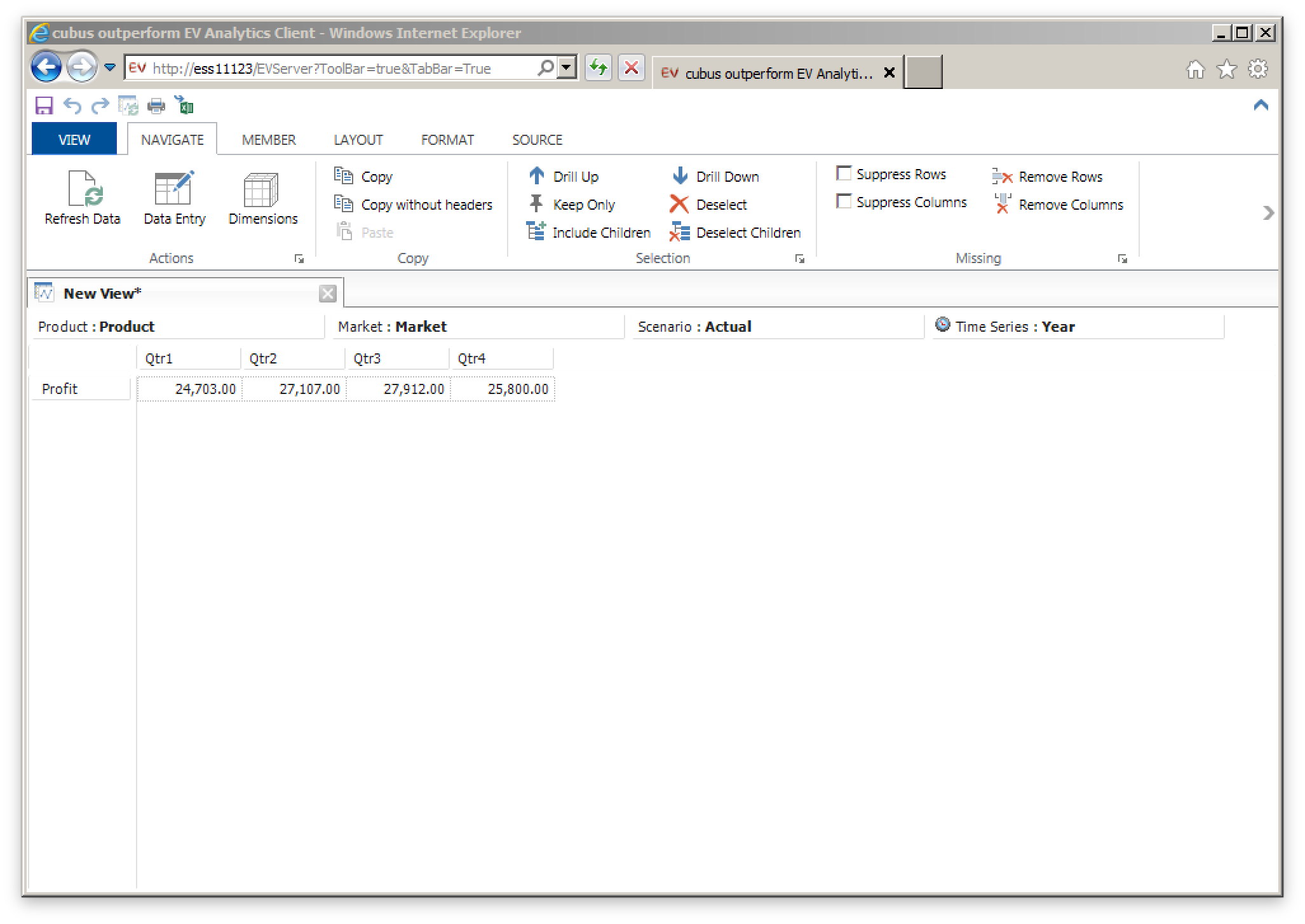
A simple view of Sample/Basic while on the Navigate ribbon
Note a few things about this user experience and the program. First of all, we are inside of Internet Explorer. EV is not a separate install for users – you pass out the URL to users and they run it themselves. This can save some serious deployment time. A typical view inside of EV will be a single grid with a single data source. In other words, the usage model is one where you have multiple data sources or multiple grids. I’m not saying this is a bad thing, mind you – I think it’s a good thing because you are trading away some of the freeform nature of Excel in exchange for a really smooth user experience.
Everything else in the screenshot should seem pretty intuitive: as with Excel you can have multiple tabs open (sheets in Excel), the POV members (in this case Product, Market, Actual) are available at the top of the sheet, and you have you normal rows and columns (Profit and the various Quarters, in this case). The various toolbar buttons available are fairly predictable in their utility.
While we’re on this screenshot, I want to mention something about the ad hoc experience that I really like. Each member in a row or column is clickable and provides various capabilities. There are two arrows on each member (up and down) and you can click or right click on them. Clicking on the down arrow on Year, for example, will replace it with the children (Qtr1, Qtr2, Qtr3, Qtr4). Right clicking on the the down arrow would drill to the children but also retain the parent. Drilling up works in a similar fashion. It seems like a small UI touch but as I have said a few times, EV is all about that smooth user experience and I think it really rewards the user that wants to be fast and efficient with their ad hoc data exploration.
Still on the subject of defining the POV, let’s say that you know or want to find the specific members you want to show. By clicking on the member itself, you can bring up a member selection box for that dimension. This is another one of the really strong points of EV because you can pick the member and no matter where in the spread it is (row, column, leftmost, topmost, etc.) it’ll automatically adjust everything for you. For example, if you are looking at Actual and Budget from the Scenario dimension and have four Quarters selected, no matter where your Time axis is, you can select any other members from the Time dimension and it’ll move everything around automatically. This is one of my pet peeves with the Member Selection box in Smart View or the old Excel add-in where the EV user experience is amazing.
Here’s the EV dialog for selecting the members you want from a dimension:
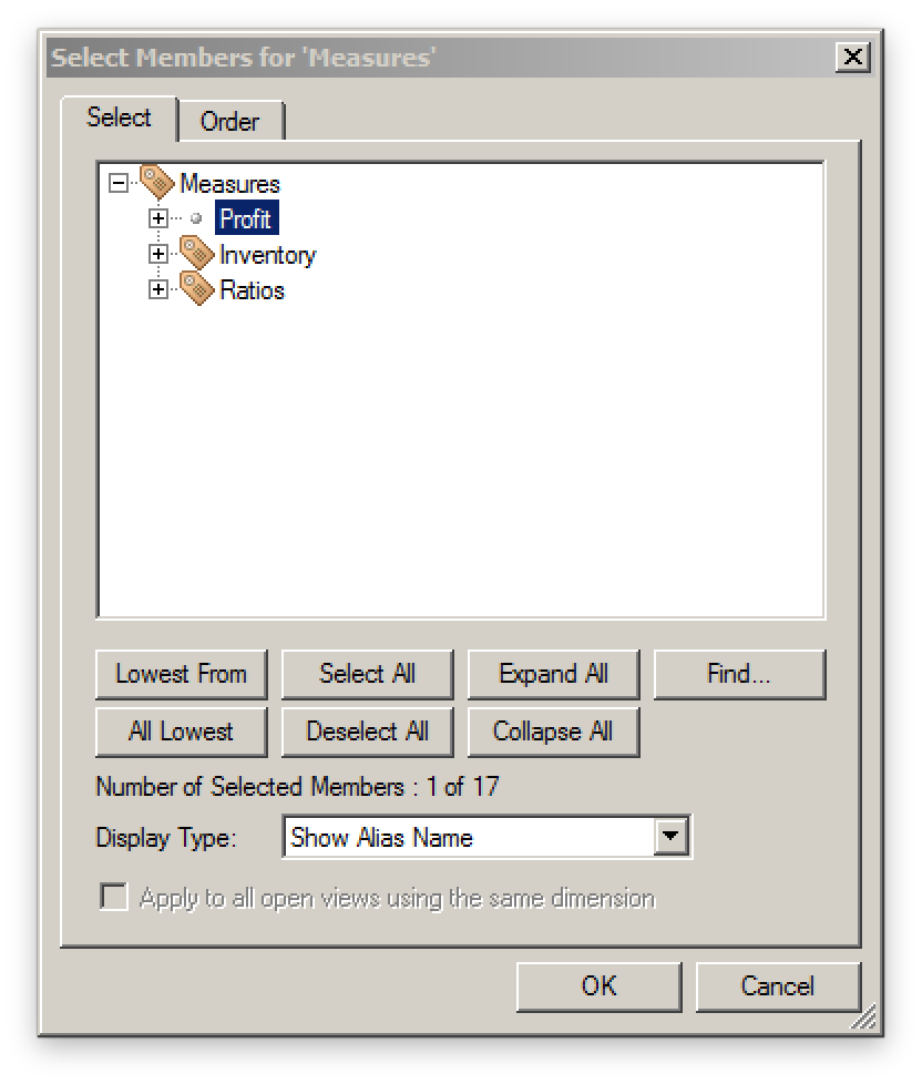
A member selector in the Measures dimension showing selection options and icons denoting Label Only members
Again, note the rich UI we get: icons for Label Only members in the outline have a little label tag on them, there are convenient buttons to select all of the members that are visible, to expand the whole hierarchy, to take the lowest, toggle aliases, and more. The Find… dialog is very convenient for quickly hanging down particular members with search criteria.
Again, as an incredibly minor detail I want to mention another UI element I love: if you want to select or deselect several members, you don’t have to individually click them. The list dialog employs this kind of smart drag where if you start highlighting a member and drag down, it selects all the members you drag to, and similarly if you are deselecting. Again, minor feature, but great user experience.
The other tab on this dialog let’s you pick the order of the members:
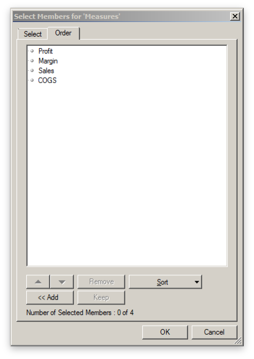
Choosing the order for selected measures
It’s a simple and intuitive dialog but has some really nice features for moving things around just how you want them, or sorting some criteria (like alphabetically or outline order). Again, the UI respects our time and gives us a way to get to exactly what we want as quickly as possible.
Moving on, let’s talk about formatting up the grid. Most traditional formatting options are available: bold, italic, background/foreground colors, and more. You can add spacing between rows and borders. Bold text is probably my most used format, followed by spacing rows out by a half a row width, then applying a border and possibly some decimal formatting.
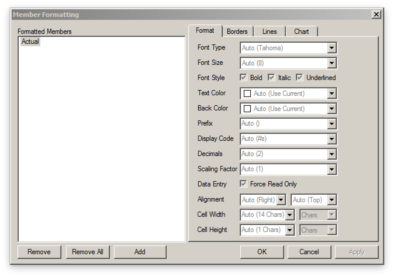
Formatting options for cells
Probably the best aspect of formatting a grid in EV is the way in which it cascades the formatting across the whole grid. Smart View these days provides improved support for pivoting around formatting, but EV has done this for years.
Think of formatting as applying to members and not particular cells. Let’s say that I have 13 members in my time dimension: all 12 months and a single total for the year. I want the total (Time/Year) for the year to be bold. I go to the formatting dialog for Time and then select bold. Now all the members in the row are bold. If I pivot Time, say from column to rows, the formatting moves with it. Now let’s say that I have different locations on this grid too, and I want the total for all locations to be underlined (for some reason). I right-click, apply the formatting, and now the totals for location are underlined and of course the total for location and time is both bold and underlined. I can pivot around all I want and this formatting will be retained. Nicely enough, if I decide to clear out all of the formatting for one of the members, I don’t have to go and “fix up” a single cell.
EV formatting is really convenient I wish Smart View was a little more like it, but I think that’s just how it has to be given the different environments and paradigms these programs use.
So let’s see here, so far we can choose a connection, pivot around, quickly drill down to the members we want to see, easily refine our member selection, reorder it, and apply formatting. Additionally, the formatting moves around easily, and is applied in a cascading manner so we don’t have to mess around with single cells and formatting getting whacky on us.
Check back tomorrow for a more of the EV user experience where I’ll cover basic chart capabilities and a few other goodies!
Your posts about cubus EV made my day. I falled in love with EV in 1999 and it never ended. For more than 15 years, I have been use every single version that has been released, including the latest cubus one, on top of both Essbase, TM1 and SSAS. I’m looking forward meeting you at Kscope 2015.