Welcome to the third part of my review of cubus outperform EV Analytics. You might want to check out the first and second parts if you’re just coming in.
Last time I left off with using EV for grid oriented operations, but EV has some compelling chart features that I wanted to go over. Probably the most compelling aspect of EV’s charting functionality is that you essentially get it for free, and it is seamlessly integrated into the EV experience.
Recall that in the previous EV reviews I did, I mentioned that EV is less freeform than Excel, in a good way. By tightening the user interaction model, EV can provide a more polished user experience. This is true of charts as well. For any given grid you may be looking at, you just have to click the chart button and EV will generate a chart. Note that EV doesn’t generate an image object for you, it literally just changes your view of the data to be a chart rather than a grid.
Here’s an example:
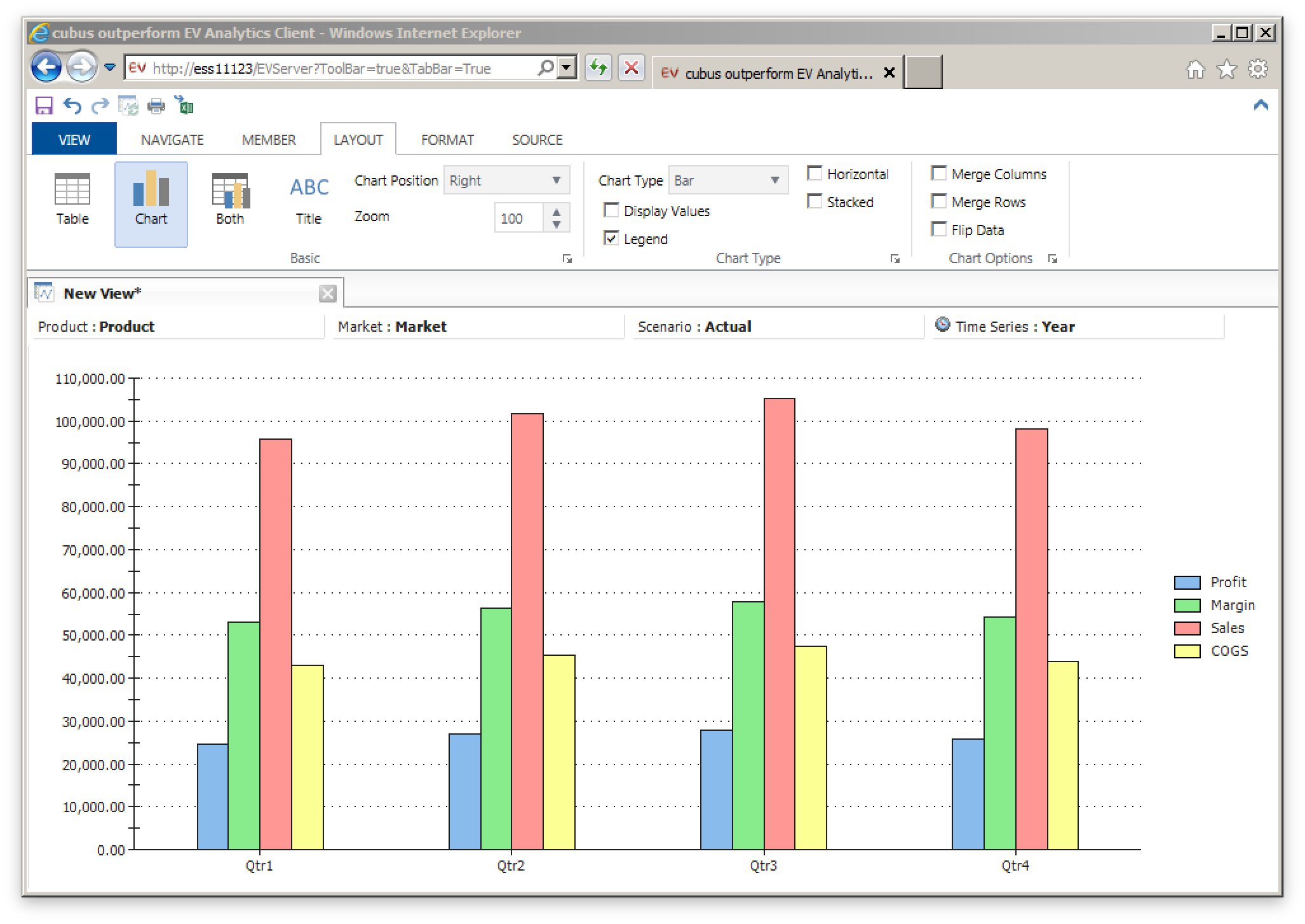
A simple Sample/Basic view that has been changed into a chart
The chart data is based on Sample/Basic as with before. The rows and columns have been used to generate the chart, and the POV/Page members are just “global” members as before. What’s really awesome is that you can click on the members (like Qtr1, Qtr2) and bring up the same member selection dialog as with before. Any member selection changes you make will be automatically reflected in real time, so there’s no chart to update or regenerate.
You can also choose to see both data and a chart at the same time, like this:
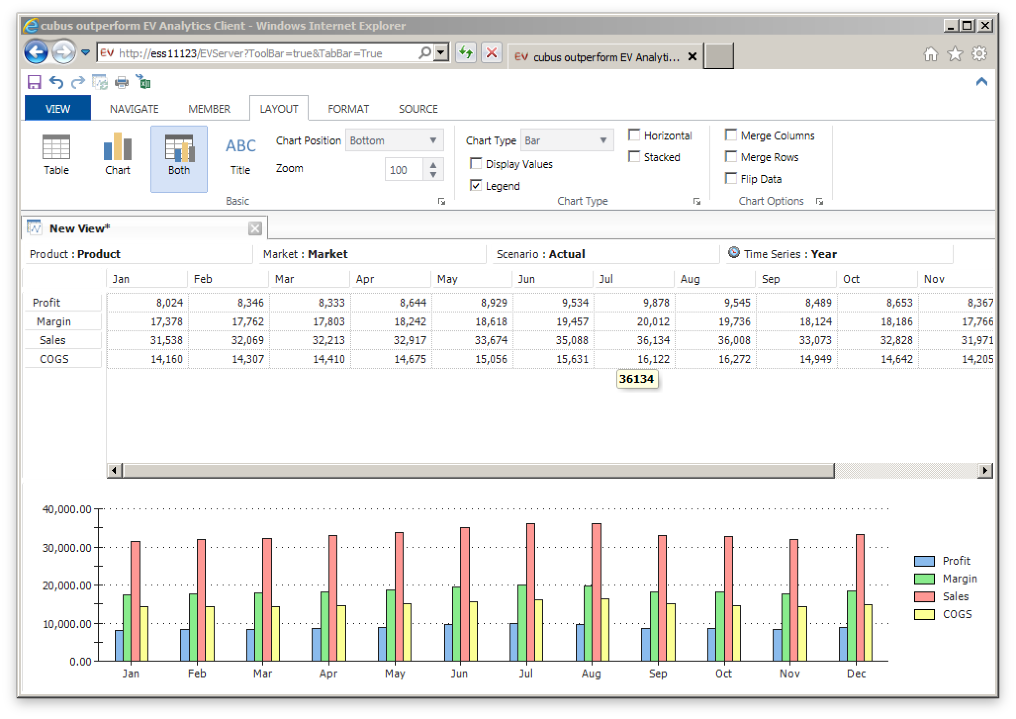
Chart and data shown at the same time (the ‘Both’ option)
This is known as “Both” mode as opposed to Table or Chart which we have now seen. EV provides some rudimentary options for arranging the positions of things. In this case it’s horizontal with chart on the bottom but this can be easily configured a little differently. Other types of charts are also provided.
The charting capabilities in EV won’t give advanced visualization tools like Tableau a run for their money, but they are definitely on par with charting in Excel and in terms of the ease of use, they are much more approachable than Tableau and even Excel. I used to create decks of reports using EV and while they were generally table-based, there were a few “jawdropper” tabs where a particular bar or pie chart really hit a point home.
This article concludes my high-level overview of EV features. This has not been an exhaustive review of EV features, mind you, as EV has some other features that are interesting. These include Canvases (multiple EV views on a single page), user input (like lock and send or submitting data), dynamic selections, awesome support for attribute dimensions and dynamic time series, traffic lighting data cells based on value, and more.
The next part and final part of this series will consider EV’s position within the enterprise and how it stacks up against other tools, including Smart View, Planning, Dodeca, and Tableau.