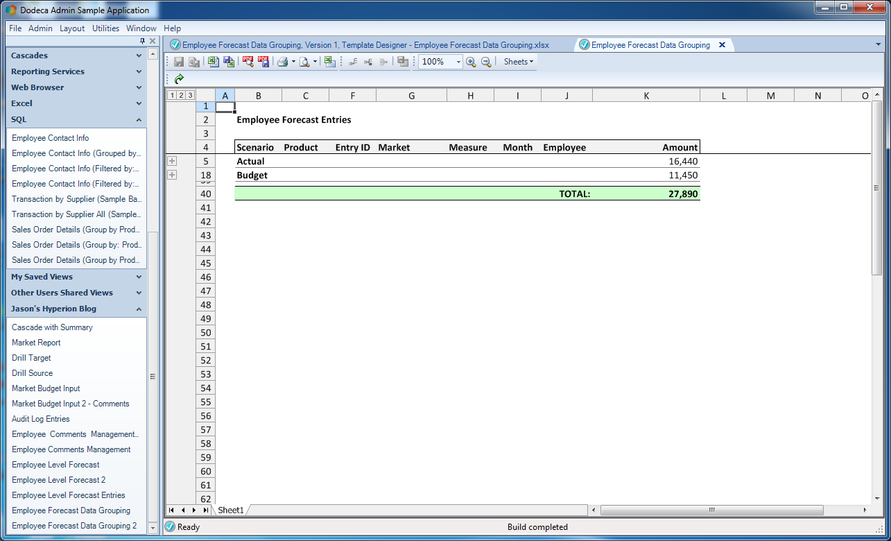
I am very pleased today to write about an incredibly awesome Dodeca capability: dynamically built groups based on relational data. This capability is interesting and useful for a variety of reasons. Using Dodeca’s spreadsheet/data/magic build paradigm, we can organize plain relational data into beautifully formatted, insightful, and dynamic views. Just to forecast where I’m headed with this, what we’re going to do is transform this plain relational data:
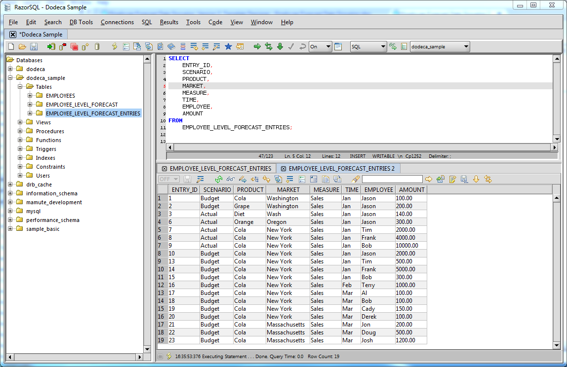
Some raw forecast related data
Into this dynamic, grouped, and formatted view:
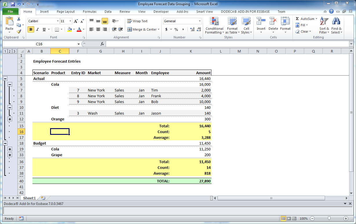
Dodeca dynamic grouping opened up in Excel
And further, we’re going to do it without writing a single line of code (save for the simple SQL Select statement). This post will assume that you’re up and running already with Dodeca’s SQL Passthrough DataSets, which I have written about before, so head over for a refresher if you need it. Also, I’ll be recycling a simple SQL table with forecast data by employee that I also used in an earlier Dodeca relational database input article, so you can read that if you want to know more about the data in play and how it relates to Sample/Basic.
Overview
To set the stage for the rest of the article, it might be useful to talk about what the pieces in play are and how fit together:
- SQL Passthrough DataSet: As covered in earlier articles, the SQL Passthrough DataSet is a discrete object within Dodeca and is where we define one or more SQL queries and an associated (also defined in Dodeca) relational connection to use. SQL Passthrough DataSets are building blocks that are referenced in other places in Dodeca, such as views and selectors. For this example, the SQL Passthrough DataSet we’ll use is relatively simple, containing basically just a SELECT query that returns the data we want.
- Grouping/Outlining functionality: this functionality is built in to Excel (and also supported in Dodeca). Grouping can be used in Excel to group similar items together such that they can be subtotaled in some way or displayed more compactly by the user. For the purposes of this article, our goal is to not just retrieve some data from a particular relational table, but to dynamically format it and put it in to groups for the user.
- Excel template: as with the other numerous examples I have discussed in the past, the Dodeca view will be built around a specially formatted Excel template. In this example, the Excel template is a little more nuanced in terms of the defined names/ranges and how they tie in with the configuration of the view
- Data Table configuration: More so than the other examples I have covered so far, in addition to specially formatting the Excel template for how we want to see our relational data, we also need to tell Dodeca how the data should be grouped, sorted, and how it ties in with our formatting.
As a sidenote, in order to keep things relatively simple here, I have chosen not to put any selectors in the view in this article. They are, of course, completely supported and in the future I’ll show some examples of that, in addition to some really interesting examples that combine relational and Essbase data.
Small Disclaimer
Before we really dive into things, I want to just mention that you’re going to see a fair number of configuration screens that need to be traversed in order to build the solution. I don’t want you to get the impression that the configuration needed is overly cumbersome. The thing is this: there are an infinite number of ways to configure how the raw data we are working with can be grouped, sorted, and displayed to the user. And as such, we have to be particular with how we define how it all works. Most of the configuration screens you’ll see are ones that you should already be familiar with if you’ve put a SQL dataset onto a Dodeca view. So the number of new screens here is fairly small. And for what it’s worth, I want to stress that other than the simple SQL SELECT query itself, we can achieve everything here without writing a single line of code, which is really saying something.
As a consultant I was engaged on numerous projects that attempted to achieve similar levels of functionality by using a custom in-house solution, usually along the lines of augmenting an Excel book with piles of custom VBA code. Now, nothing against VBA, but also as a consultant I saw time and time again that these processes became technical liabilities that made upgrades and migrations troublesome. Frequently the original author of the code had moved on as well, making updates and fixes incredibly problematic, time-consuming, and prone to error. So the thought of being able to replace mountains of custom code with something entirely declarative, maintainable, and faster to develop is amazing. So please bear with me as I work through and explain the configuration involved, it’s worth it!
Let’s Do This (#MakeSQLGreatAgain)
Above you already saw a snapshot of the data we’re working with. Our goal is to group this by scenario and product into a custom formatted arrangement. Given that data, we need to first create or otherwise ensure that our Dodeca SQL Passthrough DataSet exists. Here’s the overview of this particular SQL Passthrough DataSet:
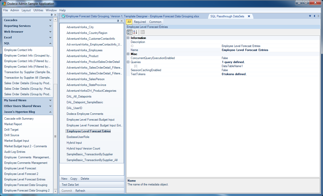
Base Dodeca SQL Passthrough DataSet configuration for demonstrative employee forecast data
This is a very straightforward and common view of the SQLPTDS. Just note that there is a single query defined. Let’s go take a look at the definition for that query:
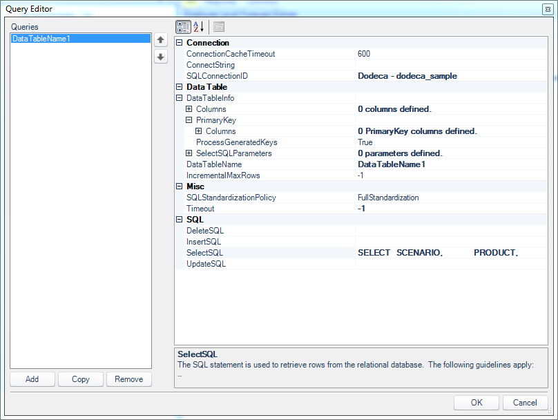
Query editor for employee forecast data SQL Passthrough DataSet
You may recall from some of the relational data input examples earlier that we specifically defined columns and primary keys. We aren’t going to do any updates here so we can leave those with default values. The only thing of note here is the definition of the SelectSQL configuration:
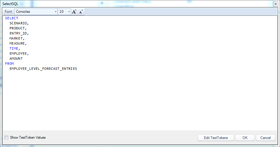
Query to pull records out of the employee forecast entry table
There’s nothing too fancy with this query. As I mentioned earlier, we’re not going to tokenize this for now, so the query will simply return everything from the table. With the SQL definitions done with, we can now turn our attention to the view itself. There’s not much in the way of non-default view configuration either, but you will note I have one DataSet defined:
Basic view configuration for our view that will display data from the configured SQL Passthrough DataSet
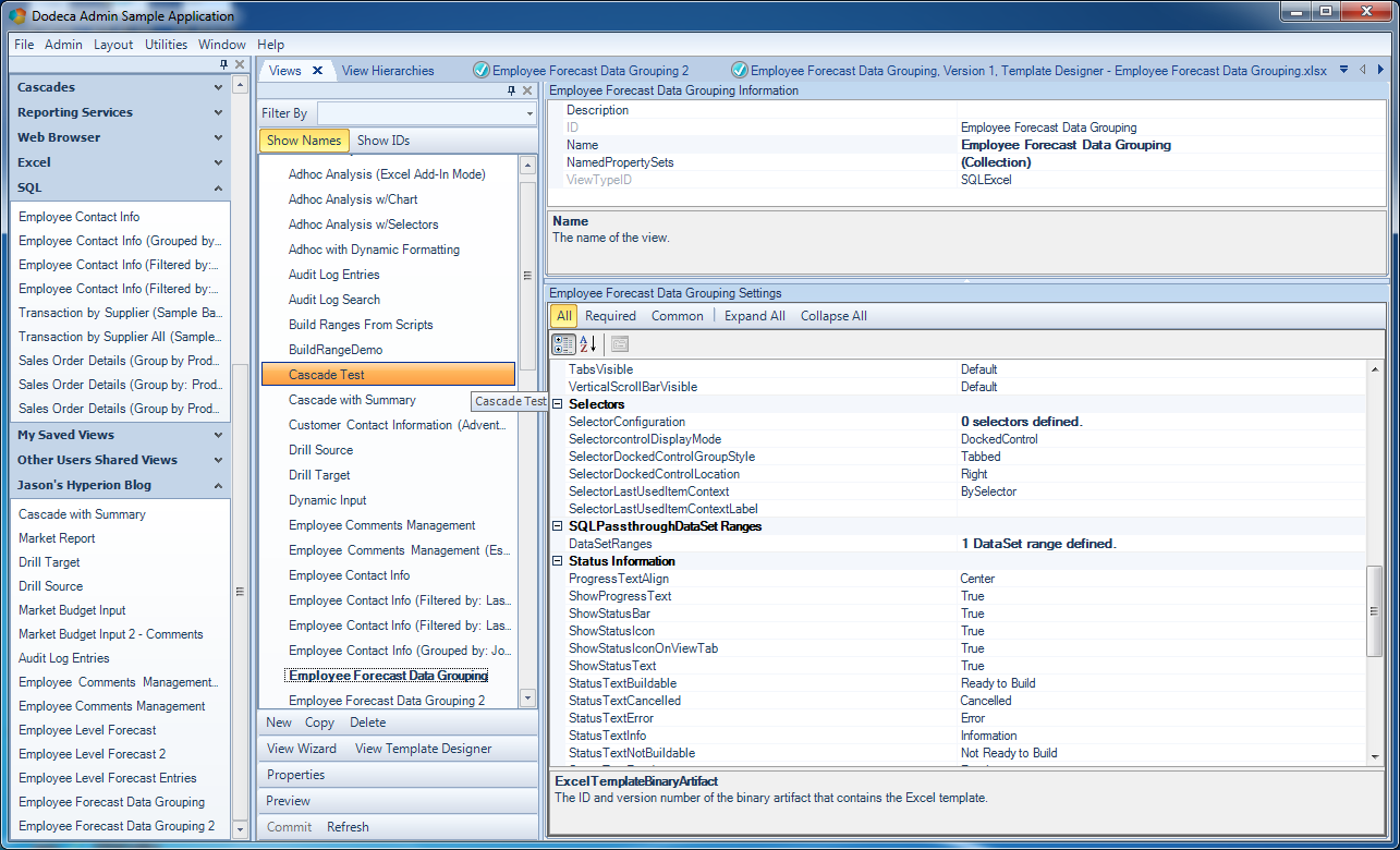
Let’s open up the DataSet Range Editor (by clicking through from the DataSetRanges configuration on the view) and take look at the configuration.

DataSet Range Editor on demonstration view
This is a pretty straightforward configuration screen without much to note. This is sort of the first place that associates our view to a distinct SQL Passthrough DataSet, so you can see where that is chosen and that there is one DataTableRange defined, which we’ll now take a look at:
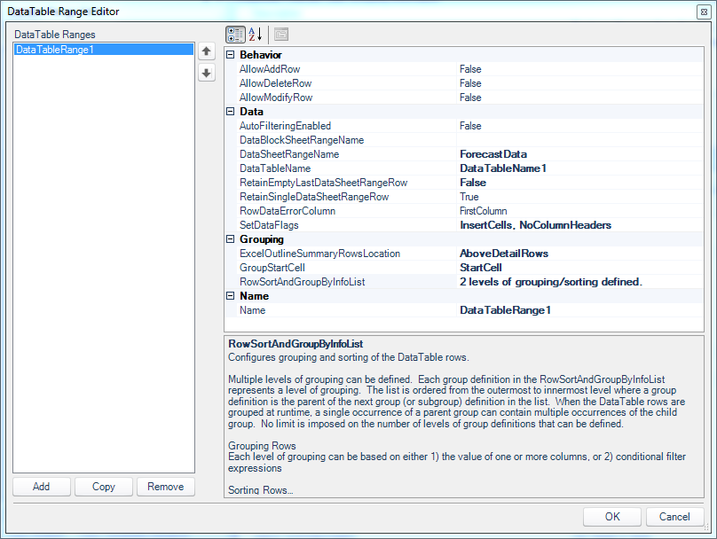
DataTable Range Editor for the views DataTable
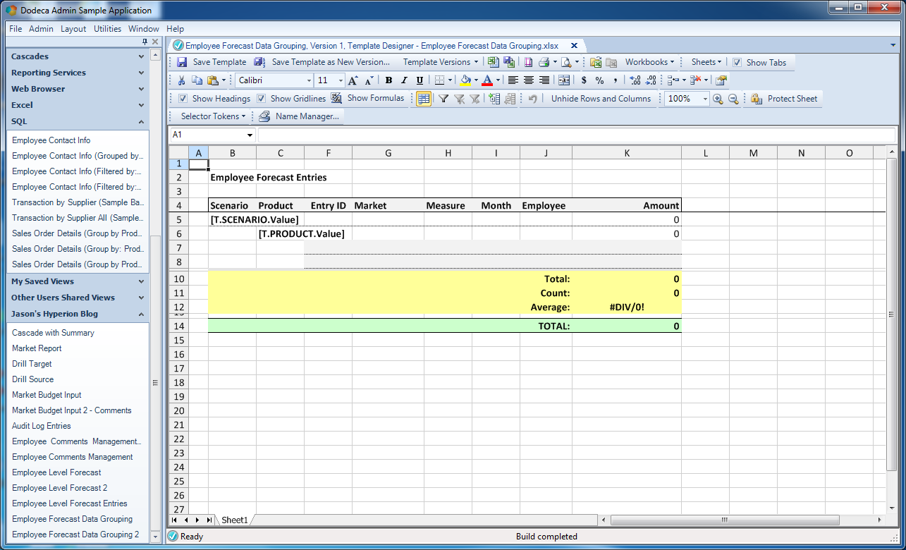
This is where things get interesting (finally), let’s walk through the elements involved here. The first configuration value of note here is the DataSheetRangeName set to ForecastData. This is where we are associating the data in the table (SQL Passthrough DataSet) to a particular named range in the template that will contain the data. Let’s skip ahead for a moment to take a look at this named range in the template:

Excel template defined range for SQL Passthrough DataSet data
Notice that I have the ForecastData range highlighted. Notice also that there is one cell in the sheet per column in the SQL Passthrough DataSet. It may seem that I am two columns short, but I actually have columns D and E hidden. These correspond to the Scenario and the Product in the data set. As you’ll see in a moment, the way I want to actually format these is that since these items make up the groups themselves, I thought it’d be redundant to show them on every row, so I just those columns (but leaving them functionally available so that Dodeca can use their values to group/sort accordingly).
Switching back to the configuration, I have a DataTableName set. This doesn’t really matter for my configuration right now so I just went with the default value of DataTableName1.
For formatting reasons, I set the RetainEmptyLastDataSheetRangeRow to False. When set to True, Dodeca will leave an extra row on data sets so that we have a natural spot to insert a new row (if we are editing the data set). Since we’re not doing any updates, and because I want to format things a little more “tightly”, I decided to make this False and leave out the extra row.
Next, over on SetDataFlags, there are multiple options enabled. These are InsertCells and NoColumnHeaders. Selecting InsertCells tells Dodeca to insert (as if by inserting a row in Excel manually) rows to the sheet when it builds it from the data. This has the effect of preserving the formulas on the sheet and their relative references. In other words, if some formula refers to a range (such as the SUM of a range) that is one cell wide by two cells tall, and we insert a cell into the middle, we want the SUM to expand to now include the three cells in height. This is just fundamental to how Excel and spreadsheets work, as well as preserving references during the Dodeca build when rows or cells are inserted.
Dodeca can return the column headers from the SQL dataset if we want them. If we did want them, then the ForecastData named range would be three rows tall instead of two as we have it. We don’t really need the column headers because we’ll put in our own “pretty” headers on the sheet and just want the data, so I’ve turned them off. Skipping over the Grouping section for a second, also notice the Name configuration value, which is just a default value we don’t need to worry about for the moment.
Grouping Configuration
Again, the options I’ve just covered won’t be new to you if you have configured SQL data on a Dodeca Excel view before. But now I’m going to get into the part that will be new to you if you haven’t worked with grouping. You’ll notice in the Grouping section three different options: ExcelOutlineSummaryRowsLocation, GroupStartCell, and RowSortAndGroupByInfoList.
The ExcelOutlineSummaryRowsLocation is fairly straightforward. I have chosen AboveDetailRows. The other option is BelowDetailRows. If you think about a typically Essbase hierarchy, for example, such as the Time dimension where Qtr1 expands into Jan, Feb, and Mar, then consider Qtr1 as the “summary” and as being “Above” the detail rows (because the children are visibly displayed below it). In the finance world it’s probably more common to have the summary below (common with subtotaling things) but for this demonstration I want them above.
Next we have the GroupStartCell. This is a defined name on my spreadsheet that indicates where the built rows should start being built. In my template, I have it below all of the template definitions but above a row that I will use to total up everything on the sheet (it’s small in the screenshot but see it just above the green rows):
Location of GroupStartCell (StartCell) defined name
Row and Group Sorting Configuration
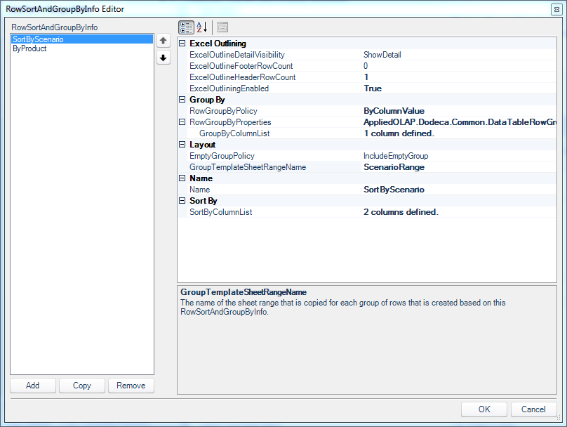
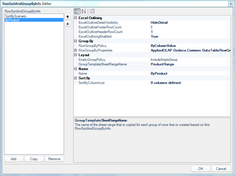
Lastly, I have the RowSortAndGroupByInfoList. The next few configuration screens I am going to show are all have to do with the configuration inside of this setting. You can see that I currently have “2 levels of grouping/sorting defined.” Generally speaking I am going to have a level of sorting/grouping defined for each grouping I do, not counting the base level data. So in this example, I will have three levels of data: by Scenario, by Product, and the data itself, but for purposes of defining the grouping/sorting, this definition pertains to the way that Scenarios are grouped and how Products are grouped within scenarios. As you’ll see momentarily, these levels of grouping correspond one to one with the named ranges/blocks within the Excel template itself. In other words, I will have a named range defining how Scenarios should be displayed, and another range for how Products will be grouped.
Let’s dive into the definition of the Grouping/Sorting dialog:
Row sorting/grouping definition, currently focused on Scenario
First of all, notice that there are two configurations in this dialog (as evidenced by the two entries on the left: one for Scenario and one for Products). The configuration we are looking at right now is for the Scenario groupings.
I’ll move through these configuration values in sequence, starting with the ExcelOutlineDetailVisibility. For this grouping (Scenarios), I have left the default of ShowDetail. This means that by default when the view is built, this grouping will be expanded. So I actually have complete control over how much detail is shown when the view is built. In a moment you’ll see that I choose the HideDetail option for the products, so that they are not shown automatically when the view is built. This is a very nice option to have so that I can choose exactly how much visible information there is for the user when they build the view, without inundating them with everything out of the gate, or forcing them to expand every node manually.
Next up are the ExcelOutlineFooterRowCount and ExcelOutlineHeaderRowCount values. Do you see in one of the earlier screenshots that for every grouping of different Scenario, there is a yellow section on it? In my template, I have defined this section to contain a Total, Count, and Average.
Think about this for a moment.
I’m getting raw data back from a SQL query. As a matter of formatting it into the way I want to see it (and they want I want my user to see it), I have decided that for each group of scenarios, I want to see the total (in this case dollars), the number of detail items, and the average of those detail items. What’s really interesting here is that I didn’t have to go about of my way to do this in the SQL query. In fact, I couldn’t have done this in the SQL query because it wouldn’t let me format and group the data how I wanted to see it and lay it out. What’s happening is that Dodeca is fetching all of that base level detail back, breaking it up into groups that I define, and then using my Excel template to build out the spreadsheet display of that data. And as part of that dynamic build process, I can leverage any functionality I want in Excel in terms of formatting and functions. This is incredible. I’m not beholden to some canned layout, or a couple of pre-programmed functions: I can have it any way I want it.
Now, getting back to the number of the header and footer row count, I can tell Dodeca about how my ranges are formatted (such as how many footer rows I have in this case) so that I have complete control over how the grouping is performed. What I want in this case is that when the groups of scenarios are collapsed, the summary detail (the yellow cells) will be hidden (collapsed into the group). So for this reason, the footer row count is set to 0, essentially meaning that there are 0 rows in the footer that I want Dodeca to leave out of the grouping. To visually display this, consider what my data looks like when I build the view but collapse down to the highest levels (the two different scenarios):
The built view, when its groupings have been manually collapsed to the highest parents (Actual and Budget)
If I wanted Dodeca to set aside some or all of the rows from the scenario summary (again, the yellow cells in this case), I could have set the footer row count to some value such as 3 or 4 so that those rows would still be visible even when the groups are fully collapsed.
Back to the row grouping options and moving ahead, notice that I have ExcelOutliningEnabled set to True. This enables the Excel grouping functionality for the group itself.
Moving forward, we have the options in the Group By category. I can choose my RowGroupByPolicy. I can choose between column values (ByColumnValue) or actually apply a filter on the data. I’m going to cover the more advanced case with a filter in a future article, so for now I am going to do it by value. For this level of grouping (by Scenario), I need to tell Dodeca which columns are in place. You can see in the screenshot that my GroupByColumnList has 1 column defined. Opening up the editor for this, we have the following:
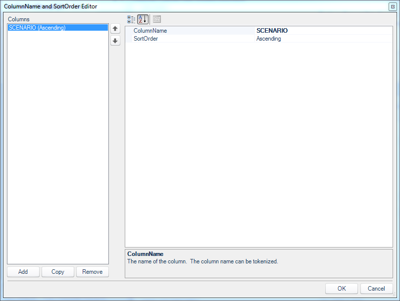
Column definition for Scenario sorting/grouping definition
This is simple enough. I just have to put in the name the corresponds to the column in the SQL Passthrough DataSet.
Over in the Layout category, I have set the GroupTemplateSheetRangeName to the named range on our Excel template that describes how to lay out groups of scenarios. So our Excel sheet’s “outer” range in this case is named ScenarioRange. Keep this in mind when we get into the layout of the Excel sheet in a bit.
Next, I am going to set the SortByColumnList to explicitly sort the data for me, since it’s not otherwise performed in the SQL Passthrough DataSet itself. The configuration for this is similarly straightforward where we just need/want to sort by the scenario and the product:
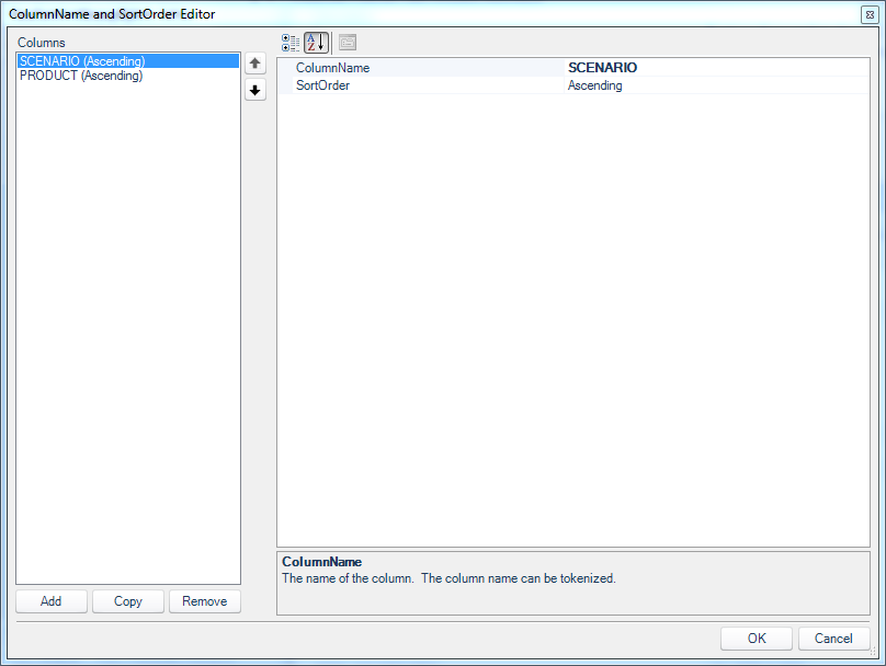
Column definition for Product sorting/grouping definition
This pretty much covers the configuration for groups of scenarios. Now we just need to do a little configuration for the groups of products that are contained within scenarios. By now this will look a bit familiar. Here is the same dialog from before, but now with the group for products selected:
Row sorting/grouping definition, currently focused on Product
Unlike before, I have set the ExcelOutlineDetailVisibility to HideDetail. So when the view is built, I don’t actually want the lowest level of detail shown to the user. Again, outlining is set to True and I have told Dodeca that I have one header row (the summary row with the name of the product itself).
Although not expanded in this screenshot, the RowGroupByProperties contains a single column entry for the PRODUCT column, similar to the definition for the scenario groupings. The last thing to note here is that the group template (named range) on the Excel template will be named ProductRange. You’ll see this as I go through the Excel template in detail.
Okay, that was a fair bit of configuration it will all be worth it when we have that sweet dynamic grouping action helping our users be happy and productive. Let’s turn our attention to the Excel template layout.
Building the Excel Template
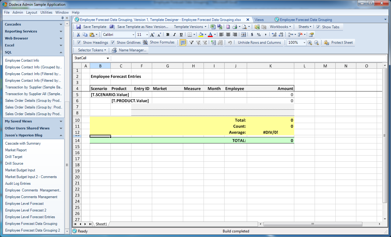
Here’s an overview of the whole template:
Excel template for the entire scenario/product grouping for the our dataset
Some things to note:
- The top four rows are all static and simply have a visible name for the report and some headers for the column values. After row four I have frozen the panes (Freeze Panes) so that the user can scroll down through the data and keep the header in place.
- You’ll see that the yellow rows are built for each group of scenarios, and include dynamic subtotals for the total, count, and average
- The green row is a summary that will be displayed once at the bottom of the entire report
Let’s take a look at the standard named range for the SQL Passthrough DataSet itself:
Excel template defined range for SQL Passthrough DataSet data
As with previous articles on this feature, this is pretty straightforward. We simply tell Dodeca about a location on the sheet that will be populated with data from the SQL query. There is one cell for each column in the query. Notice that columns D and E are hidden. These simply contained the scenario and product, and I don’t need to display them since they will be contained in headers, so I can just hide them.
The standard named range for a SQL Passthrough DataSet without column headers is two rows high, which is what I have here.
Now things start to get interesting versus previous examples with standard data sets. We are going to look at the way that groups of products will be displayed and built. Here is a named range defining the layout for products:
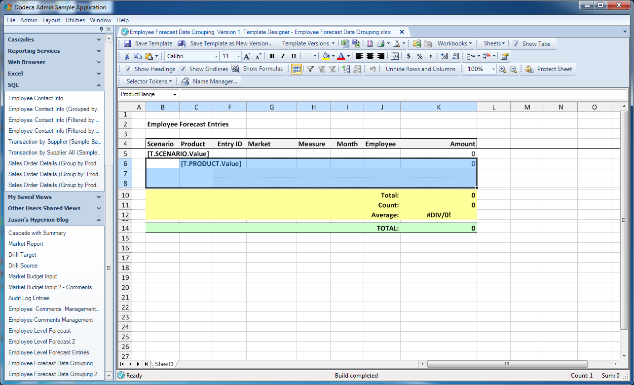
Innermost grouping range for Products
Notice that this range contains the SQL Passthrough DataSet range in it. Also notice that I have a special token at the top, [T.PRODUCT.Value]. It’s special because it let’s us get the value of the PRODUCT column and place it into the row. So in this case that’s going to be either Cola, Diet Cola, or whatever the product for the grouping is. This saves us from having to try and do some Excel formula trickery to try and grab the value of the first data row or something. Lastly, you can see that the name of this range is ProductRange and corresponds to the range in our configuration in the view earlier.
Next is the definition for the Scenario range:
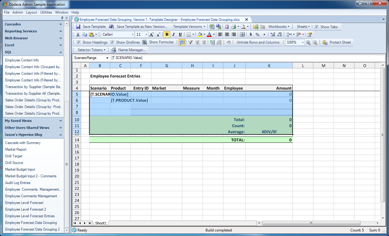
The outermost grouping template for different scenarios
Notice again that this range contains both the product range in it as well as the SQL Passthrough DataSet range. The additional nuance here is that I have a few additional rows for Total, Count, and Average. I’ll be using the Excel SUBTOTAL function in these so that I can accurately and dynamically perform these operations based on the data in the Excel groups (without double-dipping or over counting a value).
Now, remember that just the raw data is coming back from the SQL query with no totals or groupings of anything. So I’m going to lean on Excel to calculate these for me. As such, I need to plugin the appropriate formula in the right spot and referring to the proper cells, so that when Dodeca fetches and groups the data, the cell references get expanded accordingly and refer to the proper things. I am going to place these formulas in strategic locations within these named ranges so that they will calculate based on the data within the range, giving me the subtotals or whatever values I want. So let me toggle formula display on and show you what I have:
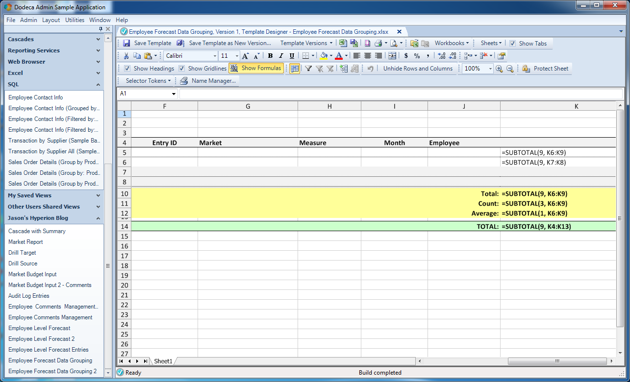
Excel template with formulas shown
So here we see that I have SUBTOTAL formulae (ooh, fancy) for each group of scenarios (this is the formula in K5, group of products (K6), and my Total/Count/Average in K10, K11, and K12 respectively.
Check out the addresses for these formulae, though. You can see that for the groups of products, I am referring to K7:K8. This corresponds exactly to the two rows contained in the range for the SQL Passthrough DataSet. Remember that InsertCells flag I mentioned earlier? When Dodeca builds this view and adds in rows from the SQL query, it’s going to perform a normal spreadsheet row insert. As such, the formulas referring to those cells will be dynamically adjusted. In effect, the range referred to by the formula will be taller, and capture the additional rows that get inserted.
The range referred to for the scenario grouping is a bit taller (K6:K9). It needs to be taller to start with so that the cells/rows getting expanded for the row build will actually be in the range that the subtotal calculates for. Notice that the range for the Total/Count/Average is the same.
Lastly is the overall formula for the entire report. This one has the widest range of all and is set so that when the entire grid is expanded, it will capture everything in it.
As a quick aside on the awesome SUBTOTAL function, it is smart enough to calculate things for me without double counting them. If I was just using SUM I’d be adding up too much – the base level data plus the intermediate subtotal values. Also, note that the first argument to SUBTOTAL defines the aggregate function to perform. The value of 9 means SUM, 3 means COUNT (COUNTA to be precise), and 1 means AVERAGE. There are numerous other functions available and supported (such as standard deviation and more).
Putting It All Together
Now for the moment of truth: we’ve defined the SQL query, configured the view, and built the template. Now for the Dodeca pixie dust engine to put it all together. Let’s see what we get:
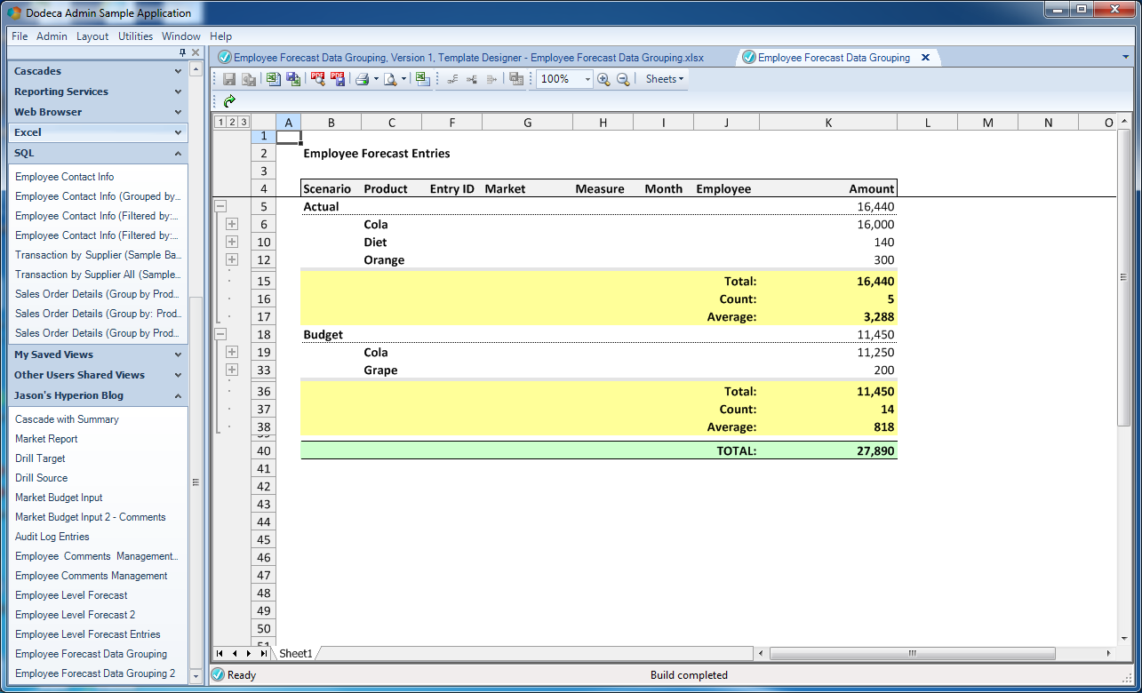
The built view expanded to its second level of detail
Everything looks good! Per my view definition, the report was built, I have one group per scenario, the product level detail is hidden by default, and I have a subtotal for the entire report (green row).
Let’s say as the user that I actually only want a higher level of detail. I can collapse the groups manually (by clicking on [-] everywhere), or just click on the [1] in the top left corner, indicating that I want to collapse the entire report down to the first level of grouping:
The built view, when its groupings have been manually collapsed to the highest parents (Actual and Budget)
Alternatively, let’s say that I want full details for everything. I can expand everything or just click on [3] and expand out to the full details:
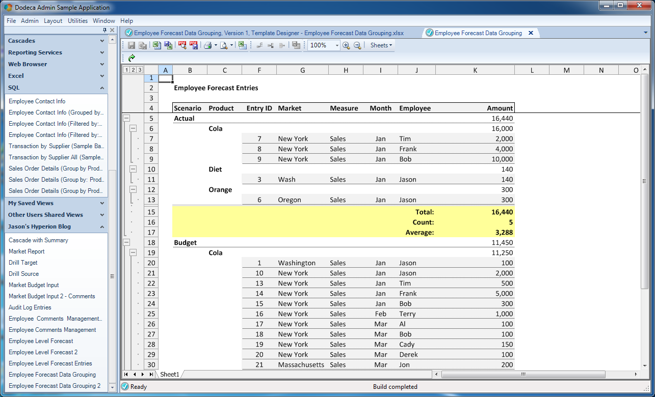
The built view expanded to all levels of detail, in this case 3
Let’s scroll to the bottom so I can checkout the page total plus the frozen panes in action:
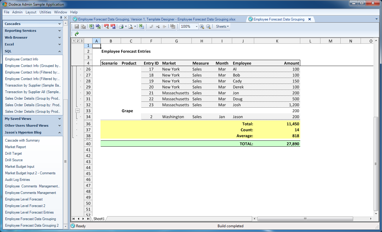
The built view, expanded to all details, scrolled to the bottom to show dynamic totals
And lastly, let’s bring everything full circle and go ahead and click on the Excel button to instantly open this in Excel, revealing that it is, in fact, using native Excel grouping functionality and that the user can do anything they want to it in Excel, or maybe just email it to someone:
Dodeca dynamic grouping opened up in Excel
Summary
I hope you enjoyed this overview of Dodeca’s innovative and powerful grouping functionality. In addition to Essbase being a first-class citizen in Dodeca, so are relational databases. The amount of configuration and flexibility available to us is immense, allowing us to very specifically format reports and data that will benefit our users the most. My favorite aspect of this exercise (other than the fact that we achieved such incredible formatting with no code at all) are the summary rows by scenario. Without having to mess around with SQL functions (or even multiple queries), we were able to pull back the data and show it in a completely arbitrary way that is most useful to our users. I think this stands in contrast to many tools that force you to work with the data in a way that is more aligned the data. As I’ve said before, we should be able to adapt the tool to our business process – not the other way around.